Assignment 4
This notebook looks at the unemployment rate for the Portland-Hillsboro-Vancouver area (in Oregon and Washington State) from January 2007 through February 2017. I want to answer the questions - How has Portland's unemployment rate changed over the last ten years and how does it compare to the national unemployment rate? Additionally, I'd like to see how well this metric follows the S&P 500 Index and the Housing Price Index.
Imports and Setup
# python standard library
import os

# third-party
import matplotlib.pyplot as pyplot
import numpy
import pandas
import pygal
import requests
import seaborn
% matplotlib inline
seaborn.set_style("whitegrid")
Data
Dropbox
National Unemployment
Portland Hillsboro Vancouver
Purchase Only House Price:
Constants
class Urls(object):
    national = "https://www.dropbox.com/s/qw2l5hmu061l8x2/national_unemployment.csv?dl=1"
    portland = "https://www.dropbox.com/s/wvux3d7dcaae5t0/portland_unemployment_2007_2017.csv?dl=1"
    house_price = "https://www.dropbox.com/s/4hu2jpjkhcnr35k/purchase_only_house_price_index.csv?dl=1"
    s_and_p = "https://www.dropbox.com/s/ojj5zp7feid6wwl/SP500_index.csv?dl=1"
class Paths(object):
    portland = "portland_unemployment_2007_2017.csv"
    national = "national_unemployment.csv"
    s_and_p = "SP500_index.csv"
    house_price = "purchase_only_house_price_index.csv"
Downloading
def download_data(path, url):
    """downloads the file if it doesn't exist
    Args:
     path (str): path to the file
     url (str): download url

    """
    if not os.path.isfile(path):
	response = requests.get(url)
	with open(path, 'w') as writer:
	    writer.write(response.text)
    return
Portland
The data represents `Local Area Unemployment Statistics` for the Portland-Hillsboro-Vancouver area in Oregon and was taken from the Bureau of Labor Statistics (the Portland-Vancouver-Hillsboro, OR-WA Metropolitan Statistical Area). It has monthly values starting from January 2007 and continues through February 2017.
Data extracted on: Apr 30, 2017 (6:54:00 PM)
Local Area Unemployment Statistics
Series Title : Unemployment Rate: Portland-Vancouver-Hillsboro, OR-WA Metropolitan Statistical Area (U) Series ID : LAUMT413890000000003 Seasonality : Not Seasonally Adjusted Survey Name : Local Area Unemployment Statistics Measure Data Type : unemployment rate Area : Portland-Vancouver-Hillsboro, OR-WA Metropolitan Statistical Area Area Type : Metropolitan areas
download_data(Paths.portland, Urls.portland)
portland = pandas.read_csv(Paths.portland)
portland.describe()
portland.head()
Cleaning
I changed to a slightly different data-source so that I could get direct links to the data, so I'm going to re-name some of the columns to match what I was using befroe
column_renames = {"Value": "unemployment_rate",
		  "Label": "date"}
portland.rename(columns=column_renames,
		inplace=True)
portland.columns
Now I'll re-do the dates.
portland.Period.unique()
I use the months in one of the plots as labels so I'm going to create a column with just their (abbreviated) names.
month_map = dict(M01="Jan", M02="Feb", M03="Mar", M04="Apr", M05="May",
		 M06="Jun", M07="Jul", M08="Aug", M09="Sep", M10="Oct",
		 M11="Nov", M12="Dec")
portland["month"] = portland.Period.apply(lambda x: month_map[x])
portland.head()
In the plot I'm going to mark where the unemployment was at its highest point.
highest_unemployment = portland.unemployment_rate.max()
print(highest_unemployment)
unemployment_peaks = numpy.where(portland.unemployment_rate==highest_unemployment)[0]
unemployment_peaks
print(portland.date.ix[unemployment_peaks[0]])
print(portland.date.ix[unemployment_peaks[1]])
It looks like it reached 11.4% twice - on June, 2009 and January of 2010.
lowest_unemployment = portland.unemployment_rate.min()
print(lowest_unemployment)
print(highest_unemployment/lowest_unemployment)
print(str(portland.date.ix[numpy.where(
    portland.unemployment_rate==lowest_unemployment)]))
At its peak, the unemployment rate for the Portland-Hillsboro-Vancouver area was almost three times higher than the most recent (preliminary) unemployment rate.
According to the National Bureau of Economic Research, the most recent economic contraction occurred from December 2007 through June 2009 which falls within the data set so I'll highlight that on the plot.
recession_start = numpy.where(portland.date=="2007 Dec")[0][0]
recession_end = numpy.where(portland.date=="2009 Jun")[0][0]
portland_recession_start = portland.unemployment_rate.iloc[recession_start]
print(portland_recession_start)
print(portland.unemployment_rate.iloc[recession_end])
When did it reach the recession-start rate?
portland.date.iloc[numpy.where(portland.unemployment_rate==portland_recession_start)[0][1]]
Unemployment Rate Over Time
First I'll plot how the unemployment rate changed over time.
figure = pyplot.figure(figsize=(10, 10))
axe = figure.gca()
seaborn.set_style("whitegrid")
portland.plot(x="date", y="unemployment_rate", ax=axe, legend=False)
axe.set_title("Portland-Hillsboro-Vancouver Unemployment Over Time")
axe.set_ylabel("% Unemployed")
axe.set_xlabel("Month")
seaborn.despine()
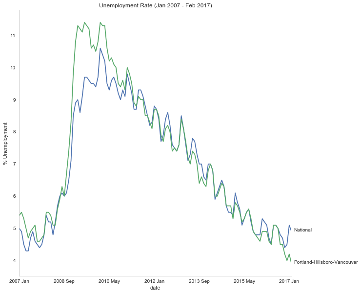
It looks like unemployment was relatively low until September of 2008, when it suddenly spiked before beginning a steady downward trend.
National
As a comparison, I downloaded the unemployment rate data for the nation as a whole (also taken from the Bureau of Labor Statistics.
NATIONAL_PATH = "national_unemployment.csv"
NATIONAL_URL = "https://www.dropbox.com/s/qw2l5hmu061l8x2/national_unemployment.csv?dl=1"
download_data(NATIONAL_PATH, NATIONAL_URL)
national = pandas.read_csv(NATIONAL_PATH)
national.head()
national.rename(columns=column_renames, inplace=True)
national.head()
The local data has one fewer month than the national one so I'll remove it here.
national.tail()
national.drop([122], inplace=True)
national.tail()
peak = national.unemployment_rate.max()
print(peak)
national_peak = numpy.where(national.unemployment_rate==peak)
print(portland.date.iloc[national_peak])
When did it reach the same level it was at when the recession began?
national_recession_start = national.unemployment_rate.iloc[recession_start]
post_recession = national[national.Year > 2009]
index = numpy.where(post_recession.unemployment_rate==national_recession_start)[0][0]
post_recession.date.iloc[index]
Plotting
I'm not going to be looking at the numbers so much as comparing plots from now on so I'll remove the grid.
style = seaborn.axes_style("whitegrid")
style["axes.grid"] = False
seaborn.set_style("whitegrid", style)
figure = pyplot.figure(figsize=(10, 10))
axe = figure.gca()
national.plot(x="date", y="unemployment_rate", ax=axe, legend=False)
portland.plot(x="date", y="unemployment_rate", ax=axe, legend=False)
axe.set_ylabel("% Unemployment")
axe.set_title("Unemployment Rate (Jan 2007 - Feb 2017)")

last = portland.date.count()
axe.text(last, national["unemployment_rate"].iloc[-1], "National")
axe.text(last, portland["unemployment_rate"].iloc[-1], "Portland-Hillsboro-Vancouver")
seaborn.despine()
S&P 500
Now I'm going to compare the unemployment rate to the S&P 500 index for the same period. The S&P 500 data came from the Federal Reserve Bank of St. Louis. It contains the S&P 500 monthly index from May 2007 through February 2017.
S and P Index
download_data(Paths.s_and_p, Urls.s_and_p)
s_and_p_index = pandas.read_csv("SP500_index.csv", na_values=".")
s_and_p_index.describe()
pre = pandas.DataFrame({"DATE": ["2007-01-01", "2007-02-01", "2007-03-01"], "VALUE": [numpy.nan, numpy.nan, numpy.nan]})
s_and_p_index = pre.append(s_and_p_index)
s_and_p_index["date"] = portland.date.values
s_and_p_index = s_and_p_index.reset_index(drop=True)
s_and_p_index.head()
s_and_p_index.tail()
s_and_p_nadir = s_and_p_index.VALUE.min()
print(s_and_p_nadir)
s_and_p_nadir = numpy.where(s_and_p_index.VALUE==s_and_p_nadir)[0]
print(s_and_p_index.date.iloc[s_and_p_nadir])
So the stock-market hit bottom in December of 2008, six months before the Portland-Hillsboro-Vancouver unemployment rate reached its (first) high-point and ten months before the national unemployment rate hit its peak.
Next I'll see if plotting the S&P 500 Index vs Unemployment Rate data shows anything interesting.
figure = pyplot.figure(figsize=(10, 10))
axe = figure.gca()
# the S&P data is missing the first four months so slice
# the unemployment data
axe.plot(s_and_p_index.VALUE, national.unemployment_rate)
axe.plot(s_and_p_index.VALUE, portland.unemployment_rate)
axe.set_title("Unemployment Rate vs S&P 500")
axe.set_xlabel("S&P 500 Index")
axe.set_ylabel("% Unemployment")
last_x = s_and_p_index.VALUE.iloc[-1] + 100
axe.text(last_x, national.unemployment_rate.iloc[-1], "National")
axe.text(last_x, portland.unemployment_rate.iloc[-1], "Portland-Hillsboro-Vancouver")
seaborn.despine()
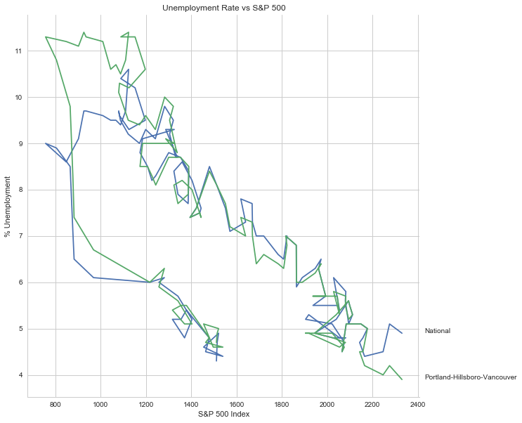
It looks like as the S&P 500 goes down, the unemployment rate goes up, then, while the unemployment rate is at its peak, the S&P 500 starts to increase, even as the unemployment rate stays high, until around the time when it reached 1200, the unemployment rates began to go down as the stock market improved.
Purchase Only House Price Index for the United States.
This data also came from the Federal Reserve Bank of St. Louis. It is based on more than six million repeat sales transactions on the same single-family properties. The original source of the data was the Federal Housing Finance Agency (but it only provides an xls file, not a csv, so I took it from the FED). From the FHFA:
The HPI is a broad measure of the movement of single-family house prices. The HPI is a weighted, repeat-sales index, meaning that it measures average price changes in repeat sales or refinancings on the same properties. This information is obtained by reviewing repeat mortgage transactions on single-family properties whose mortgages have been purchased or securitized by Fannie Mae or Freddie Mac since January 1975.
The HPI serves as a timely, accurate indicator of house price trends at various geographic levels. Because of the breadth of the sample, it provides more information than is available in other house price indexes. It also provides housing economists with an improved analytical tool that is useful for estimating changes in the rates of mortgage defaults, prepayments and housing affordability in specific geographic areas.
The HPI includes house price figures for the nine Census Bureau divisions, for the 50 states and the District of Columbia, and for Metropolitan Statistical Areas (MSAs) and Divisions.
download_data(Paths.house_price, Urls.house_price)
house_price_index = pandas.read_csv("purchase_only_house_price_index.csv")
house_price_index.describe()
house_price_index.head()
house_price_index["price"] = house_price_index.HPIPONM226S
house_price_index["date"] = portland.date[1:].values
house_price_index.head()
pre = pandas.DataFrame({"DATE": ["2007-01-01"], "HPIPONM226S": [numpy.nan], "price": [numpy.nan], "date": ["2007 Jan"]})
house_price_index = pre.append(house_price_index)
house_price_index = house_price_index.reset_index(drop=True)
house_price_index.head()
house_price_index.tail()
housing_nadir = house_price_index.price.min()
print(housing_nadir)
housing_nadir = numpy.where(house_price_index.price==housing_nadir)[0]
print(house_price_index.date.iloc[housing_nadir])
The House Price Index hit its low point about two and a half years after the stock market hit its low point.
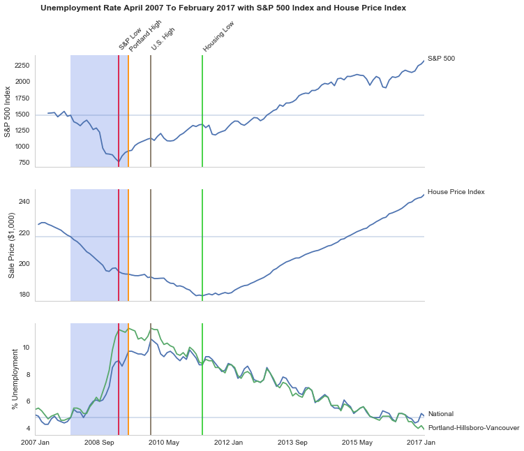
The Final Plot
figure , axes = pyplot.subplots(3,
				sharex=True)
(sp_axe, housing_axe, unemployment_axe) = axes
figure.set_size_inches(10, 10)

# plot the data
s_and_p_index.plot(x="date", y="VALUE", ax=sp_axe,
		   legend=False)
house_price_index.plot(x="date", y="price", ax=housing_axe,
		       legend=False)

national.plot(x="date", y="unemployment_rate", ax=unemployment_axe,
	      legend=False)
portland.plot(x="date", y="unemployment_rate", ax=unemployment_axe,
	      legend=False)

# plot the peaks/low-points as vertical lines
peak_color = "darkorange"
# portland-unemployment peaks
for peak in unemployment_peaks:
    for axe in axes:
	axe.axvline(peak, color=peak_color)

points = ((s_and_p_nadir, "crimson"),
	  (housing_nadir, "limegreen"),
	  (national_peak, "grey"))

for point, color in points:
    for axe in axes:
	axe.axvline(point, color=color)

# level at the start of the recession (it was the same for both Portland and the U.S.)
unemployment_axe.axhline(national.unemployment_rate.iloc[recession_start], alpha=0.25)
housing_axe.axhline(
    house_price_index.price.iloc[
	numpy.where(house_price_index.date=="2007 Dec")[0][0]], alpha=0.25)
sp_axe.axhline(
    s_and_p_index.VALUE.iloc[
	numpy.where(s_and_p_index.date=="2007 Dec")[0][0]], alpha=0.25)

# add labels
unemployment_axe.set_ylabel("% Unemployment")
unemployment_axe.set_xlabel("")

housing_axe.set_ylabel("Sale Price ($1,000)")
sp_axe.set_ylabel("S&P 500 Index")

figure.suptitle("Unemployment Rate April 2007 To February 2017 with S&P 500 Index and House Price Index",
		weight="bold")

# label the data lines
last = portland.date.count()
unemployment_axe.text(last, national.unemployment_rate.iloc[-1], "National")
unemployment_axe.text(last, portland.unemployment_rate.iloc[-1], "Portland-Hillsboro-Vancouver")
sp_axe.text(last, s_and_p_index.VALUE.iloc[-1], "S&P 500")
housing_axe.text(last, house_price_index.price.iloc[-1], "House Price Index")

# color in the recession
sp_axe.axvspan(recession_start, recession_end, alpha=0.25, facecolor='royalblue')
housing_axe.axvspan(recession_start, recession_end, alpha=0.25, facecolor='royalblue')
unemployment_axe.axvspan(recession_start, recession_end, alpha=0.25, facecolor='royalblue')

# label the vertical lines
sp_axe.text(s_and_p_nadir, s_and_p_index.VALUE.max() + 450, "S&P Low", rotation=45)
sp_axe.text(unemployment_peaks[0], s_and_p_index.VALUE.max() + 575,  "Portland High", rotation=45)
sp_axe.text(housing_nadir, s_and_p_index.VALUE.max() + 550, "Housing Low", rotation=45)
sp_axe.text(36, s_and_p_index.VALUE.max() + 450, "U.S. High", rotation=45)
seaborn.despine()

# add a caption
# the coursera sight gives you the option to add a caption via the GUI
# figure.text(.1,.000001, """
#    Monthly Unadjusted Unemployment Rates for the Portland-Hillsboro-Vancouver area and the entire United States of America compared with the S&P 500 Index and
#    House Price Index for the same period. The blue highlighted area is a period of economic contraction (December 2007 through June 2009) defined by the National
#    Bureau of Economic Research. The vertical lines represent (red) the low-point for the S&P 500, (orange) the first peak of the Portland-Hillsboro-Vancouver area
#    unemployment, (gray) the peak of U.S. unemployment (overlaps second Portland-area value matching its first peak), and (green) the low-point for the house-price index.
#    The horizontal lines are the values for the metrics at the start of the recession.""")
line = pygal.Line()
line.x_labels = s_and_p_index.date
line.add("date", house_price_index.price)
line.render_to_file("unemployment_portland_vs_us_2004_2017.svg")
# plot the data
# add a caption
# the coursera sight gives you the option to add a caption via the GUI
# figure.text(.1,.000001, """
#    Monthly Unadjusted Unemployment Rates for the Portland-Hillsboro-Vancouver area and the entire United States of America compared with the S&P 500 Index and
#    House Price Index for the same period. The blue highlighted area is a period of economic contraction (December 2007 through June 2009) defined by the National
#    Bureau of Economic Research. The vertical lines represent (red) the low-point for the S&P 500, (orange) the first peak of the Portland-Hillsboro-Vancouver area
#    unemployment, (gray) the peak of U.S. unemployment (overlaps second Portland-area value matching its first peak), and (green) the low-point for the house-price index.
#    The horizontal lines are the values for the metrics at the start of the recession.""")
The visualization created was meant to show how Portland, Oregon, United States' unemployment rate related to the national unemployment rate, the stock market, and housing prices. The seasonally unadjusted employment rates for the Portland-Vancouver-Hillsboro area were retrieved from the Bureau of Labor Statistics' web-site, along with the unadjusted unemployment rates for the nation as a whole for the months from January 2017 through February 2017. Hillsboro is an incorporated part of metropolitan Portland and Vancouver is just North of Portland so many of its residents commute to Portland to work, and vice-versa. The monthly S&P 500 Index from May 2007 through February 2017 along with the Purchase Only Price Index from February 2007 through February 2017 were retrieved from the St. Louis Federal Reserve website. The S&P 500 index is the market capitalization of 500 large companies listed on the New York Stock Exchange or NASDAQ. The Purchase Only House Price Index is the average price change in repeat sales or refinancing of the same houses and is maintained by Federal Housing Finance Agency. The beginning and ending of the recession within this time period was taken from the National Bureau of Economic Research (https://www.nber.org/cycles.html).
The visualization shows that during the recession, beginning in roughly September 2008, Portland's unemployment rate rose faster than the nation as a whole did, but by roughly May 2011 (coinciding with the lowest valuation for the House Price Index) it had dropped slightly lower than the national rate and has stayed in step with it, although it has thus far not followed the uptick in the national rate that began in November of 2016. Additionally the visualization shows the relative timing of the changes in the three metrics. In the year leading up to the recession, unemployment was relatively flat (ignoring the seasonal changes) and the S&P also began relatively flat but then began a downward trend later in the year, the House Price Index, on the other hand, spent most of it starting what would become a four-year decline (since this was during the sub-prime mortgage crisis, this is perhaps not so surprising). The S&P 500 hit its low point during the recession, as might be expected, but the peaks for the unemployment rates occurred when the recession was already over. Also, while the S&P 500 recovered relatively quickly, the unemployment rates for both Portland and the United States as a whole did not reach the level that they were at when the recession began until October 2015.
Truthfulness:
To provide a baseline of trustworthiness I used only government sources (although, of course, some might see that as a negative).
Beauty:
The internal grid was left out and in its place only vertical and horizontal lines for key values were highlighted (the vertical line represent the worst points for each metric, the horizontal lines the values that the metrics held when the recession began - so the point at which the horizontal line intersects the line after the recession is its recovery point) in an attempt to increase the data-ink ratio.
Functionality:
The data was plotted with a shared x-axis and three separate y-axes so that the states of each could be compared at the same point in time without distorting the plots due to the differing scales for each metric. I didn't include 0 on the y-axes, but the point was to observe inflection points and trends rather than measure exact values so I felt that this was unnecessary (it added a lot of whitespace without actually changing the shapes). As mentioned in the previous section, key points in the data were highlighted (including the time of the recession) so that the viewer could have some additional background information with regard to what was happening, and not just wonder what the strange spike in unemployment was about (or needing to know all the dates ahead of time).
Insightfulness:
By comparing the Portland unemployment rates to the national rates it hopefully revealed the story of how Portland did with regards to the rest of the country - initially doing worse than the nation, then catching up, and currently doing a little better. Additionally, by adding the context of the recession, as well as the performance of the S&P 500 index and the House Price Index during the same period, I hoped to show how unemployment (at least in this time period) moved in relation to other parts of the economy.


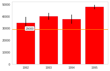
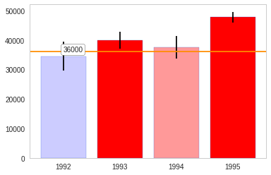
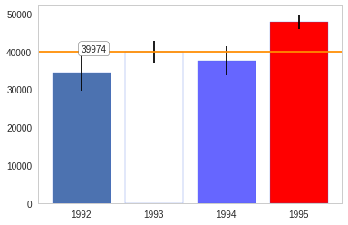
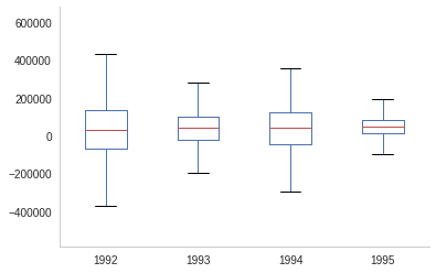 The box-plot shows once again that the centers are relatively close. But 1992 and 1994 have considerably more spread than 1993 and especially more than 1995.
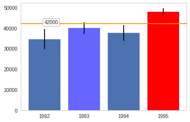