A First Look at dplyr

In the Beginning

This is a look at dplyr based on Chapter Three of R For Data Science. It focuses on what the book identifies as the six key dplyr functions.

Function What It Does By Another Name
filter Pick out rows based on their values. Boolean Slice
arrange Re-order the rows. Sort
select Pick out variables by their names. Column subset
mutate Create new variables using existing ones. Feature Engineering
summarize Summarize many values as a single value. Statistic
group_by Changes scope of other functions to operate on group.  

Imports

library(ascii)
library(assertthat)
library(dplyr)
library(ggplot2)
library(knitr)
library(nycflights13)
library(tidyverse)

Note: The stuff in the tidyverse tends to clobber built-in functions, which can make it hard to understand sometimes when things go wrong. If you forget to load dplyer, for instance, there's already a filter function, but it doesn't do the same thing as the one you load with dplyr so you'll get weird error messages if you try to use it. Notably I was getting this message:

Error in filter(airlines, carrier == "US") : object 'carrier' not found

Anyway, now some options for the packages.

options(asciiType="org")
theme_set(theme_minimal(base_family="Palatino"))

And a couple of helpers to print (the tibble objects dump weird characters into the org-mode output).

khead <- function(data) {
  #' Prints a table of the first lines of the dataframe
  #'
  #' @param data The data to print
  table <- kable(head(data))
  table[2] <- gsub(":", "-", table[2])
  table
}

okable <- function(data) {
  #' Prints data as an org-mode table
  #'
  #' @param data The data to print
  table <- kable(data)
  table[2] <- gsub(":", "-", table[2])
  table
}

got_all_your_data <- function(data) {
  #' Checks if there's any missing values
  #'
  #' @param data The vector of data to check
  see_if(noNA(data))
}

The Data

We're going to look at the flights dataframe loaded by the nycflights13 package (which, curiously, R loads using the library function).

str(flights)
tibble [336,776 × 19] (S3: tbl_df/tbl/data.frame)
 $ year          : int [1:336776] 2013 2013 2013 2013 2013 2013 2013 2013 2013 2013 ...
 $ month         : int [1:336776] 1 1 1 1 1 1 1 1 1 1 ...
 $ day           : int [1:336776] 1 1 1 1 1 1 1 1 1 1 ...
 $ dep_time      : int [1:336776] 517 533 542 544 554 554 555 557 557 558 ...
 $ sched_dep_time: int [1:336776] 515 529 540 545 600 558 600 600 600 600 ...
 $ dep_delay     : num [1:336776] 2 4 2 -1 -6 -4 -5 -3 -3 -2 ...
 $ arr_time      : int [1:336776] 830 850 923 1004 812 740 913 709 838 753 ...
 $ sched_arr_time: int [1:336776] 819 830 850 1022 837 728 854 723 846 745 ...
 $ arr_delay     : num [1:336776] 11 20 33 -18 -25 12 19 -14 -8 8 ...
 $ carrier       : chr [1:336776] "UA" "UA" "AA" "B6" ...
 $ flight        : int [1:336776] 1545 1714 1141 725 461 1696 507 5708 79 301 ...
 $ tailnum       : chr [1:336776] "N14228" "N24211" "N619AA" "N804JB" ...
 $ origin        : chr [1:336776] "EWR" "LGA" "JFK" "JFK" ...
 $ dest          : chr [1:336776] "IAH" "IAH" "MIA" "BQN" ...
 $ air_time      : num [1:336776] 227 227 160 183 116 150 158 53 140 138 ...
 $ distance      : num [1:336776] 1400 1416 1089 1576 762 ...
 $ hour          : num [1:336776] 5 5 5 5 6 5 6 6 6 6 ...
 $ minute        : num [1:336776] 15 29 40 45 0 58 0 0 0 0 ...
 $ time_hour     : POSIXct[1:336776], format: "2013-01-01 05:00:00" "2013-01-01 05:00:00" ...

The dataset lists all the flights that left New York City airports in 2013 heading to destinations in the United States, Puerto Rico, and the American Virgin Islands.

Filter

The Basic Filter

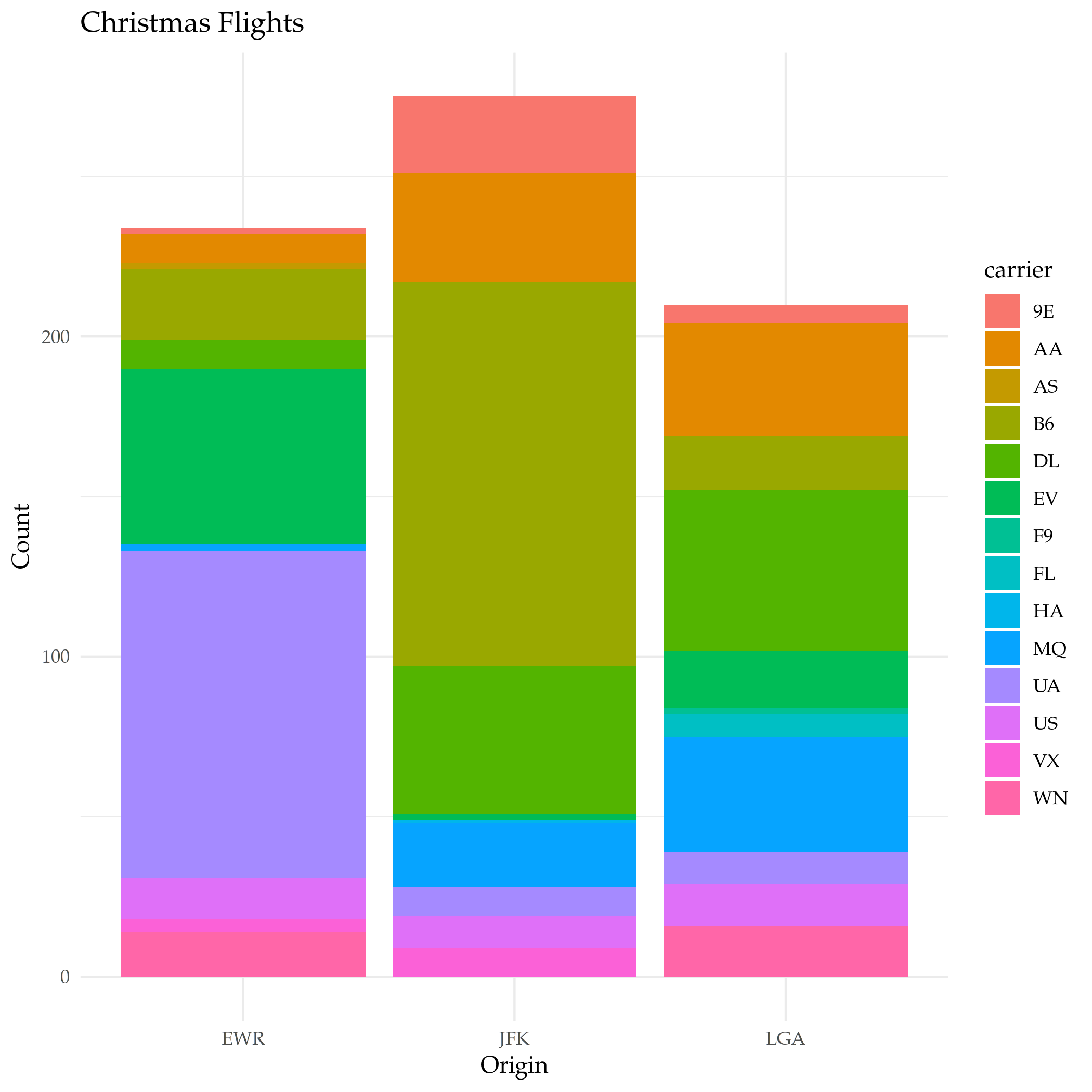
filter takes the dataframe as the first argument and every argument after that has to be a boolean expression based on the dataframe. If you pass in more than one condition dplyr will and them. Let's see the flights on Christmas.

christmas <- filter(flights, month==12, day==25)
plot = ggplot(data=christmas) +
  geom_bar(
    mapping=aes(x=origin, fill=carrier)
  ) +
  labs(title="Christmas Flights", x="Origin", y="Count")

ggsave("christmas_flights_counts.png")
nil

Or, Not And

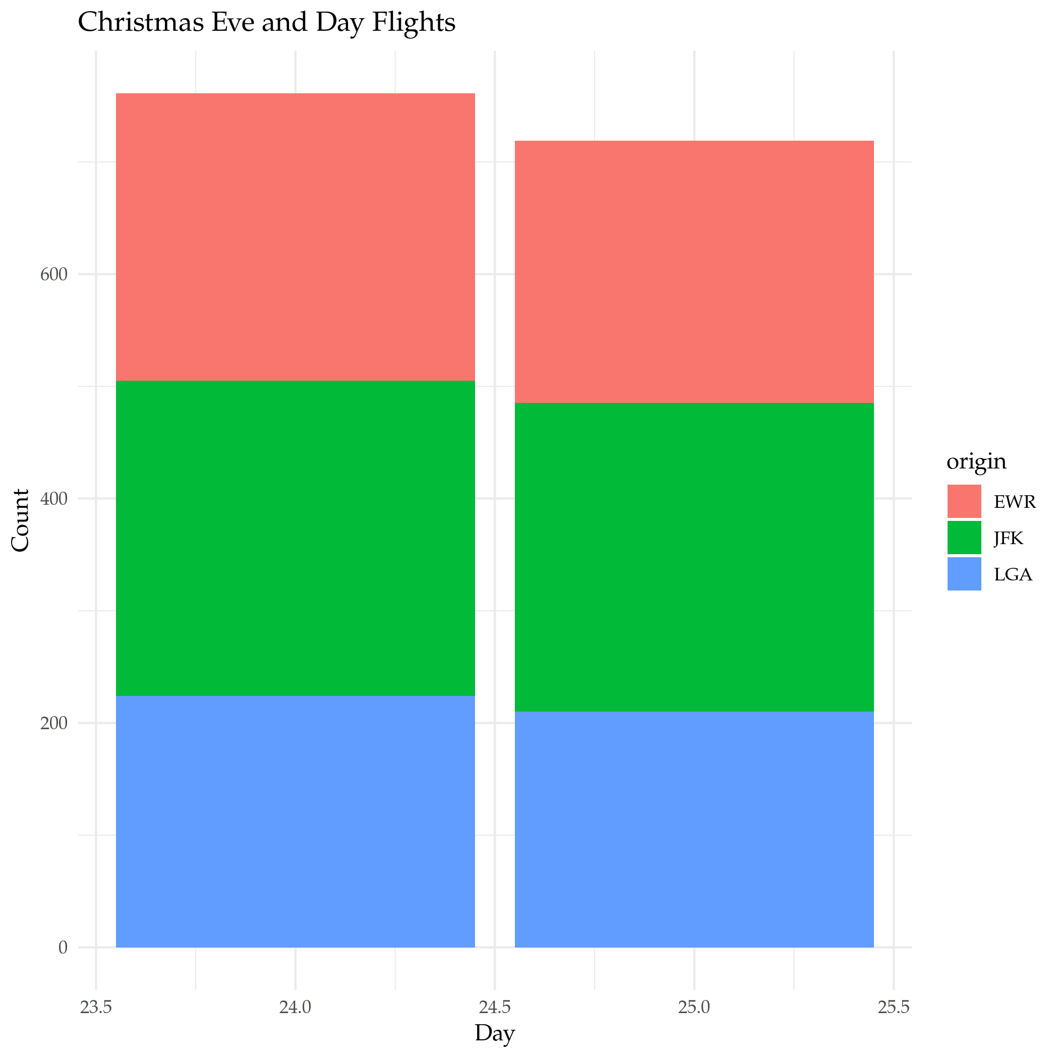
Since the default is for the filter to and everything together, if you want to use something else (like OR) you need to create a single argument built with the OR operator (|). If you're using a single column for the OR, there's actually a (possibly) easier way that works like python's in where you check if the value is in a collection. Let's see the flights on Christmas and on Christmas Eve .

both_days <- filter(flights, month==12, day %in% c(24, 25))

plot = ggplot(data=both_days) +
  geom_bar(
    mapping=aes(x=day, fill=origin)
  ) +
  labs(title="Christmas Eve and Day Flights", x="Day", y="Count")

ggsave("christmas_day_and_eve.png")
nil

And and Or

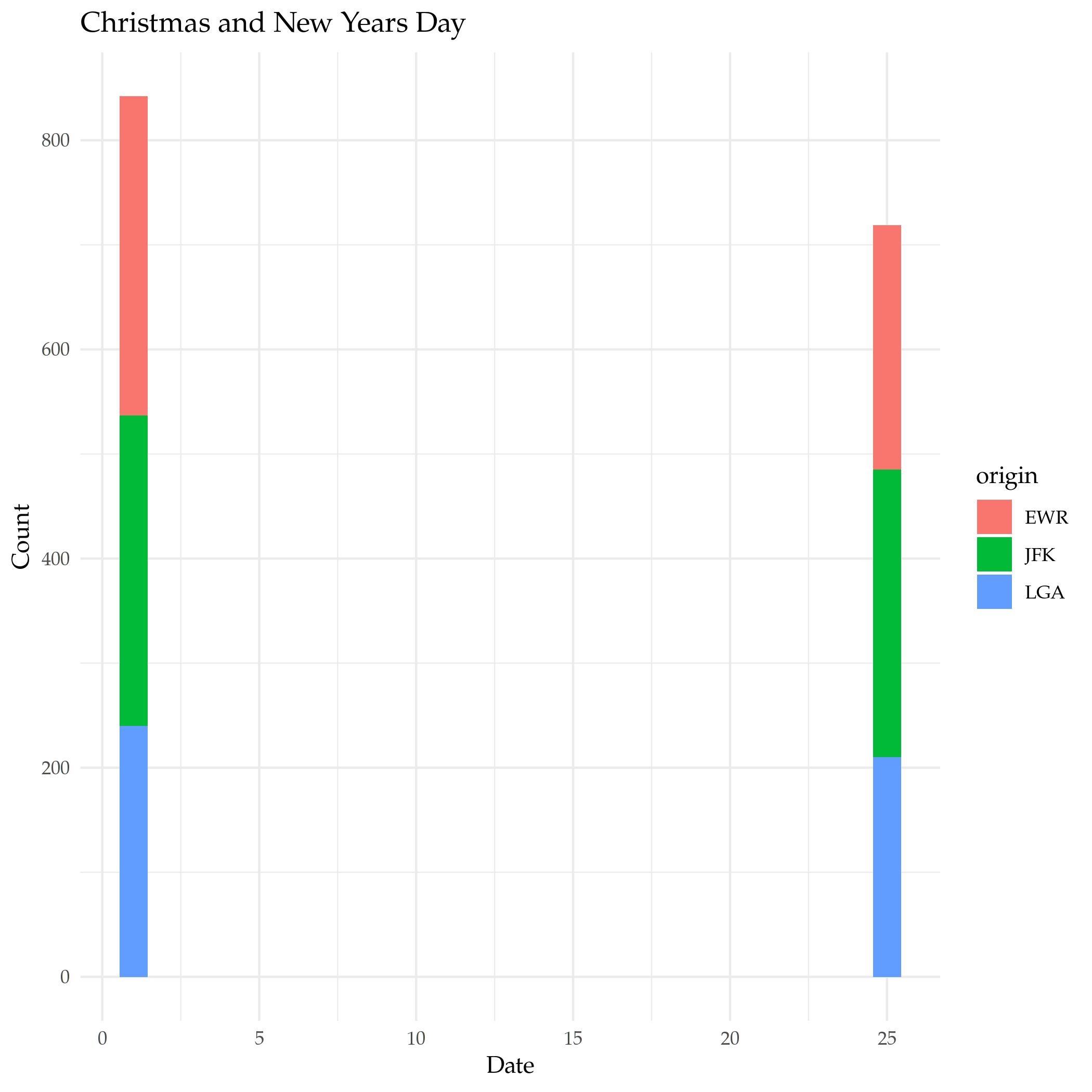
What if we want New-Years Day and Christmas? In this case we need to keep the month with the day so we can't just use the in operator, but we can use the AND and OR operators to make it work.

and_new_years = filter(flights, (month==12 & day==25) | (month==1 & day==1))

plot = ggplot(data=and_new_years) +
  geom_bar(
    mapping = aes(x=day, fill=origin)
  ) +
  labs(title="Christmas and New Years Day", x="Date", y="Count")

ggsave("christmas_new_years.png")
nil

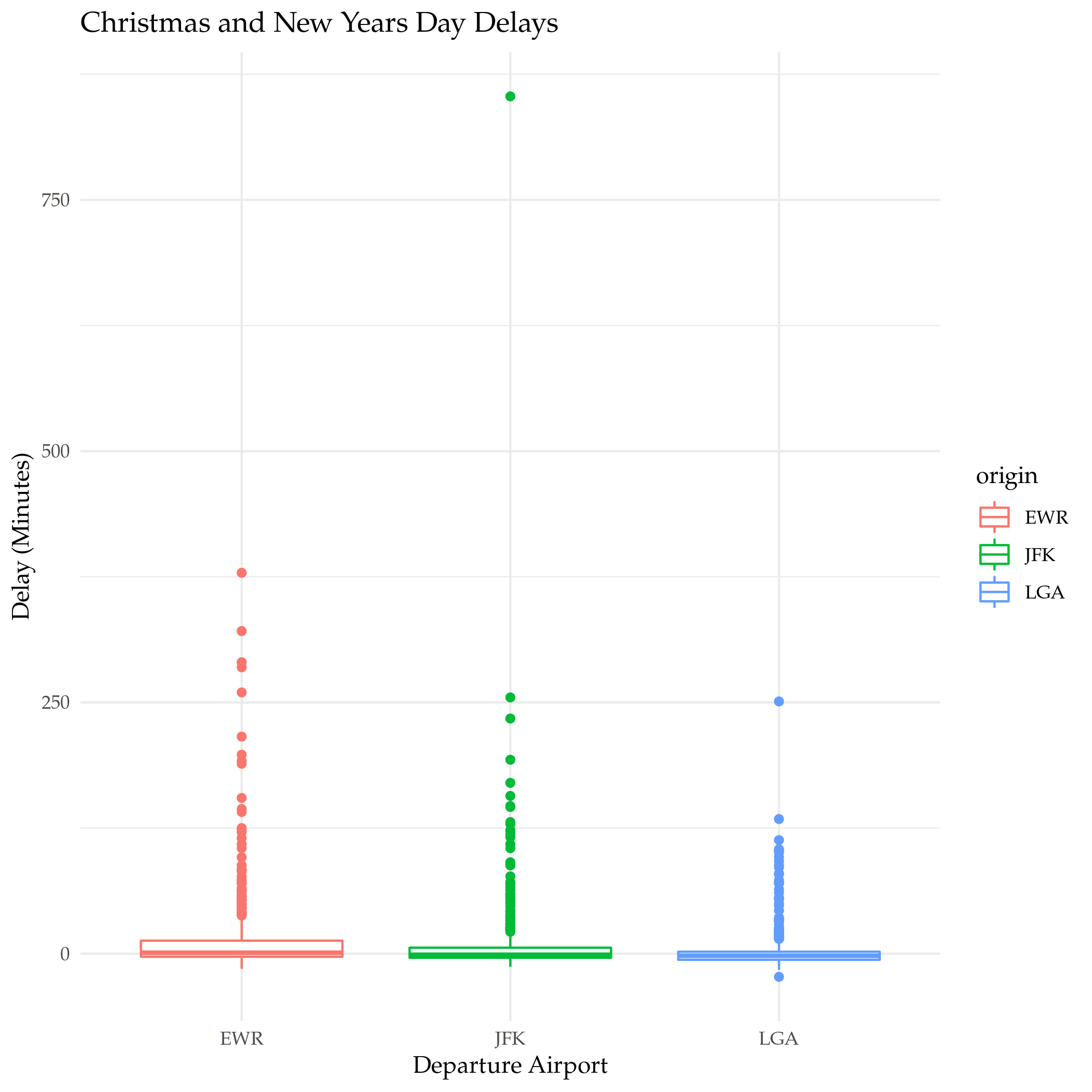
plot = ggplot(data=and_new_years) +
  geom_boxplot(
    mapping = aes(x=origin, y=dep_delay, color=origin)
  ) +
  labs(title="Christmas and New Years Day Delays", x="Departure Airport", y="Delay (Minutes)")

ggsave("christmas_new_years_delay.png")
nil

Arrange

arrange is a function to sort the rows. By default it sorts then in non-decreasing (ascending) order using a column you give it. You can givie it multiple columns in which case whenever there's a tie it will look in the next column you gave it to see if it can break it (the tie, I mean).

Ascending Order

What are the shortest flights?

khead(arrange(flights, distance))
year month day dep_time sched_dep_time dep_delay arr_time sched_arr_time arr_delay carrier flight tailnum origin destination air_time distance hour minute time_hour
2013 7 27 NA 106 NA NA 245 NA US 1632 NA EWR LGA NA 17 1 6 2013-07-27 01:00:00
2013 1 3 2127 2129 -2 2222 2224 -2 EV 3833 N13989 EWR PHL 30 80 21 29 2013-01-03 21:00:00
2013 1 4 1240 1200 40 1333 1306 27 EV 4193 N14972 EWR PHL 30 80 12 0 2013-01-04 12:00:00
2013 1 4 1829 1615 134 1937 1721 136 EV 4502 N15983 EWR PHL 28 80 16 15 2013-01-04 16:00:00
2013 1 4 2128 2129 -1 2218 2224 -6 EV 4645 N27962 EWR PHL 32 80 21 29 2013-01-04 21:00:00
2013 1 5 1155 1200 -5 1241 1306 -25 EV 4193 N14902 EWR PHL 29 80 12 0 2013-01-05 12:00:00

The data uses the three-letter airport codes, but there's another dataframe loaded with ggplot2 named airports that we can use to translate them to airport names.

okable(filter(airports, faa %in% c("PHL", "LGA", "EWR")))
faa name lat lon alt tz dst tzone
EWR Newark Liberty Intl 40.69250 -74.16867 18 -5 A America/New_York
LGA La Guardia 40.77725 -73.87261 22 -5 A America/New_York
PHL Philadelphia Intl 39.87194 -75.24114 36 -5 A America/New_York

So the shortest flights are from Newark Liberty International to La Guardia airport and the Philadelphia International Airport. I wonder why someone would take a plane to go 17 miles? I guess the traffic must be really bad, or some people just have money (and jet fuel) to burn.

Descending Order

To get the data to sort in descending order you have to pass in another function call (desc). Weird.

What are the longest flights?

khead(arrange(flights, desc(distance)))
year month day dep_time sched_dep_time dep_delay arr_time sched_arr_time arr_delay carrier flight tailnum origin destination air_time distance hour minute time_hour
2013 1 1 857 900 -3 1516 1530 -14 HA 51 N380HA JFK HNL 659 4983 9 0 2013-01-01 09:00:00
2013 1 2 909 900 9 1525 1530 -5 HA 51 N380HA JFK HNL 638 4983 9 0 2013-01-02 09:00:00
2013 1 3 914 900 14 1504 1530 -26 HA 51 N380HA JFK HNL 616 4983 9 0 2013-01-03 09:00:00
2013 1 4 900 900 0 1516 1530 -14 HA 51 N384HA JFK HNL 639 4983 9 0 2013-01-04 09:00:00
2013 1 5 858 900 -2 1519 1530 -11 HA 51 N381HA JFK HNL 635 4983 9 0 2013-01-05 09:00:00
2013 1 6 1019 900 79 1558 1530 28 HA 51 N385HA JFK HNL 611 4983 9 0 2013-01-06 09:00:00

You can probably guess the airports from the codes, but we'll look them up anyway.

okable(filter(airports, faa %in% c("JFK", "HNL")))
faa name lat lon alt tz dst tzone
HNL Honolulu Intl 21.31868 -157.92243 13 -10 N Pacific/Honolulu
JFK John F Kennedy Intl 40.63975 -73.77893 13 -5 A America/New_York

And the longest flights are from John F. Kennedy International airport to Honolulu International airport.

Select

select helps with getting subsets of columns. At first glance this seems like something that should be easy to do without needing a separate function, but it adds more ways to grab the columns than just passing in the names.

Grab Some Columns

The basic way to get a subset of columns is to pass them in as arguments.

khead(select(flights, month, flight))
month flight
1 1545
1 1714
1 1141
1 725
1 461
1 1696

A Range of Columns

If you want to grab a section of contiguous columns you can pass in the first and last ones separated by a colon (the `:` character, not the vital organ).

khead(select(flights, dep_time:arr_time))
dep_time sched_dep_time dep_delay arr_time
517 515 2 830
533 529 4 850
542 540 2 923
544 545 -1 1004
554 600 -6 812
554 558 -4 740

Helper Functions

Like arrange select uses functions passed in to alter the behavior. Most of them are string-methods-ish.

Function What it does
starts_with("<prefix>") Pick columns by a prefix.
ends_with("<suffix>") Pick columns with a suffix.
contains("<sub-string>") Pick columns with a sub-string of the name.
matches("<regular-expression>") Pick out stuff using a regular expression.
num_range("<prefix>", <number range>) Grab columns with the prefix followed by each of the numbers
last_col() Get the last column (negative index).
all_of(<vector>) Grab the columns in the vector.
any_of(<vector>) Same as all_of but ignores non-existent columns in the vector
where(<function>) Applies the function to the columns and picks the ones that return true

You can also use logical AND and OR operators or a vector to combine the selections, but we'll just do a basic one-function call. Let's grab all the columns with an underscore in their name.

khead(select(flights, contains("_")))
dep_time sched_dep_time dep_delay arr_time sched_arr_time arr_delay air_time time_hour
517 515 2 830 819 11 227 2013-01-01 05:00:00
533 529 4 850 830 20 227 2013-01-01 05:00:00
542 540 2 923 850 33 160 2013-01-01 05:00:00
544 545 -1 1004 1022 -18 183 2013-01-01 05:00:00
554 600 -6 812 837 -25 116 2013-01-01 06:00:00
554 558 -4 740 728 12 150 2013-01-01 05:00:00

You can also negate the selections using an exclamation point (!), so we can grab all the columns that don't have an underscore in their name like this.

khead(select(flights, !contains("_")))
year month day carrier flight tailnum origin dest distance hour minute
2013 1 1 UA 1545 N14228 EWR IAH 1400 5 15
2013 1 1 UA 1714 N24211 LGA IAH 1416 5 29
2013 1 1 AA 1141 N619AA JFK MIA 1089 5 40
2013 1 1 B6 725 N804JB JFK BQN 1576 5 45
2013 1 1 DL 461 N668DN LGA ATL 762 6 0
2013 1 1 UA 1696 N39463 EWR ORD 719 5 58

Renaming

The book mentions renaming under the select section because it says that it is a special case of selection, but it has a dedicated function to do that named rename that you should use instead. Let's rename the first column (year).

khead(rename(flights, Jahr=year))
Jahr month day dep_time sched_dep_time dep_delay arr_time sched_arr_time arr_delay carrier flight tailnum origin dest air_time distance hour minute time_hour
2013 1 1 517 515 2 830 819 11 UA 1545 N14228 EWR IAH 227 1400 5 15 2013-01-01 05:00:00
2013 1 1 533 529 4 850 830 20 UA 1714 N24211 LGA IAH 227 1416 5 29 2013-01-01 05:00:00
2013 1 1 542 540 2 923 850 33 AA 1141 N619AA JFK MIA 160 1089 5 40 2013-01-01 05:00:00
2013 1 1 544 545 -1 1004 1022 -18 B6 725 N804JB JFK BQN 183 1576 5 45 2013-01-01 05:00:00
2013 1 1 554 600 -6 812 837 -25 DL 461 N668DN LGA ATL 116 762 6 0 2013-01-01 06:00:00
2013 1 1 554 558 -4 740 728 12 UA 1696 N39463 EWR ORD 150 719 5 58 2013-01-01 05:00:00

Note: Pay attention to the funky syntax - the new name comes first and the original name comes after the equal sign.

Some More Useful Renaming

That wasn't really helpful, so how about we rename some other columns?

flights <- rename(flights, destination=dest)

Mutate

The mutate function adds a column (or columns) to the end of the dataframe based on things you tell it to do to one or more other columns.

First, we'll grabs a subset of columns to make this easier to see.

subset = select(flights, ends_with("delay"), air_time, distance)
khead(subset)
dep_delay arr_delay air_time distance
2 11 227 1400
4 20 227 1416
2 33 160 1089
-1 -18 183 1576
-6 -25 116 762
-4 12 150 719

Now to add a couple of columns giving the difference between how late they arrived and how late they left and the average speed.

khead(mutate(subset,
             Time_Made_Up=dep_delay - arr_delay,
             Miles_Per_Minute = distance/air_time
             ))
dep_delay arr_delay air_time distance Time_Made_Up Miles_Per_Minute
2 11 227 1400 -9 6.167401
4 20 227 1416 -16 6.237885
2 33 160 1089 -31 6.806250
-1 -18 183 1576 17 8.612022
-6 -25 116 762 19 6.568966
-4 12 150 719 -16 4.793333

Transmute

This is like the mutate function but it only keeps the new columns you created, not the original columns.

khead(transmute(subset,
       Time_Made_Up=dep_delay - arr_delay,
       Miles_Per_Hour = distance/(air_time/60)
       ))
Time_Made_Up Miles_Per_Hour
-9 370.0441
-16 374.2731
-31 408.3750
17 516.7213
19 394.1379
-16 287.6000

Summarize

summarize reduces a collection of numbers to a single summary statistic. As an example we can look at the median departure delay. First, let's check if it has any missing values.

got_all_your_data(flights$dep_delay)
[1] FALSE
attr(,"msg")
[1] "data contains 8255 missing values"

Okay, so we'll just tell median to ignore it.

okable(summarize(flights, median_departure_delay=median(dep_delay, na.rm=TRUE)))
median_departure_delay
-2

What if we hadn't ignored the missing?

okable(summarize(flights, median_departure_delay=median(dep_delay)))
median_departure_delay
NA

The R summary functions like median and mean consider any missing data invalid unless you tell it to ignore the missing. How is this use of summarize different from just calling median?

median(flights$dep_delay, na.rm=TRUE)
[1] -2

Well, it doesn't look quite as nice. So, you might think, well, all we did was add a columns name, was that useful?

Grouping

The reason for summarize is that it works in tandem with groups. Instead of finding the median for the whole column, we can find the median by group.

by_month = group_by(flights, month)

okable(summarize(by_month, median_monthly_delay=median(dep_delay, na.rm=TRUE)))
month median_monthly_delay
1 -2
2 -2
3 -1
4 -2
5 -1
6 0
7 0
8 -1
9 -3
10 -3
11 -3
12 0

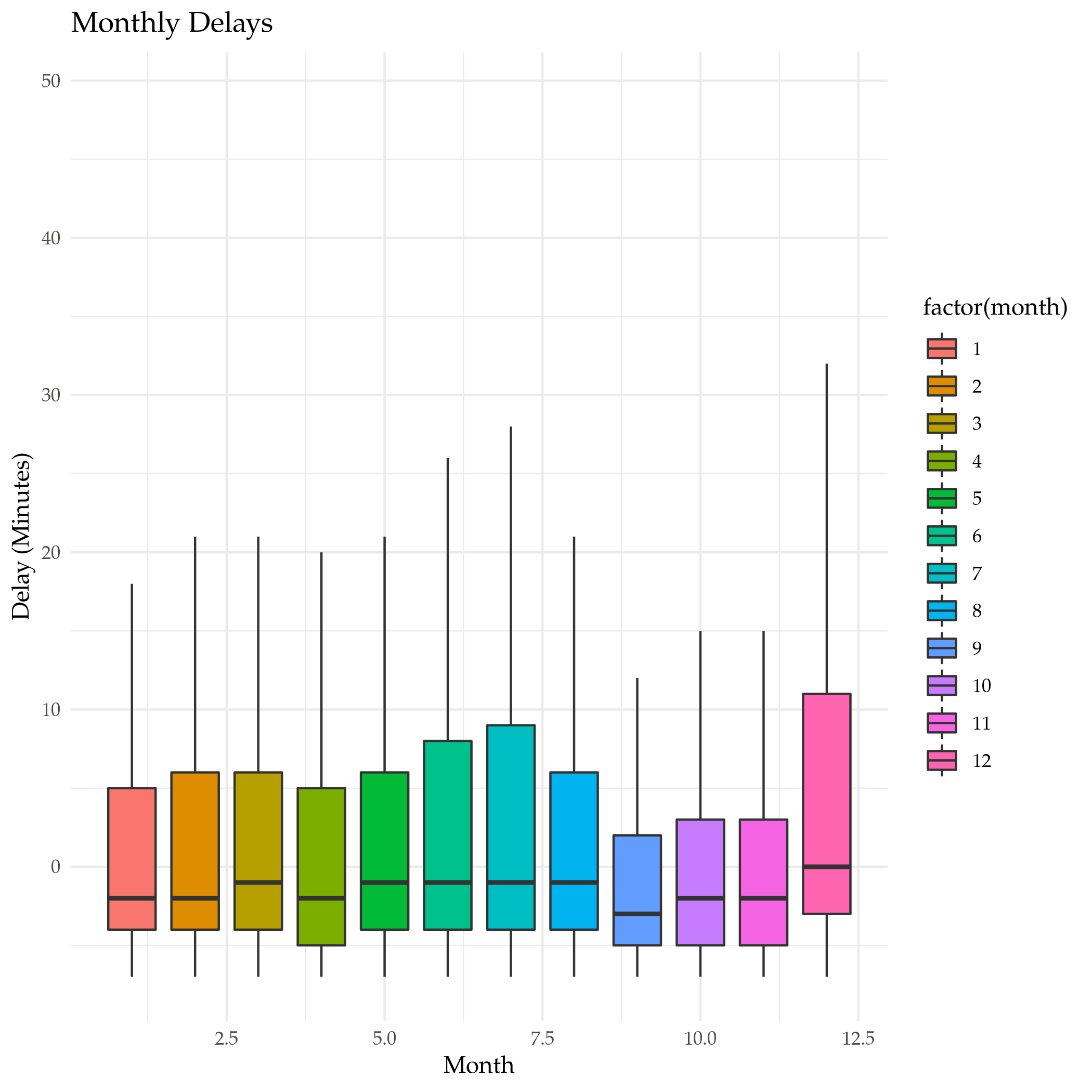
Is that right? Let's look at a boxplot of the dataset and check.

plot = ggplot(data=by_month) +
  geom_boxplot(
    mapping=aes(x=month, y=dep_delay, fill=factor(month)), 
    outlier.shape=NA,
    na.rm=TRUE
  ) +
  scale_y_continuous(limits = quantile(by_month$dep_delay, c(0.1, 0.9),
                                       na.rm=TRUE)) +
  labs(title="Monthly Delays", x="Month", y="Delay (Minutes)")


ggsave("monthly_delay_boxplot.png")
nil

So, that isn't so exciting, but it does show that the median values tend to be negative (meaning they left early) like our summary said.

Hitting the Pipe

dplyr adds an operator called the "pipe" (%>%) that works like a unix pipe does, sending the output of one function to another, allowing you to save some keystrokes adding temporary variables or nesting function calls.

So, here's what we're going to do.

  • We're going to pass the flights dataset to the group_by function and group the data by destination
  • Then we're going to pass that output to the summarize function and summarize by:
    • the counts
    • mean distance of the flight
    • and the mean arrival delay of each group
  • Then we're going to pass the summarized data to filter to get the top 20 that didn't go to Honolulu.

First let's do a check for missing values.

got_all_your_data(flights$arr_delay)
got_all_your_data(flights$distance)
[1] FALSE
attr(,"msg")
[1] "data contains 9430 missing values"
[1] TRUE

There's no missing distances but there are missing arrival delays.

delays_vs_distance <- flights %>%
  group_by(destination) %>%
  summarize(
    count = n(),
    distance = mean(distance, na.rm = TRUE),
    delay = mean(arr_delay, na.rm = TRUE)
  ) %>%
  filter(count > 20, destination != "HNL")

khead(delays_vs_distance)
destination count distance delay
ABQ 254 1826.0000 4.381890
ACK 265 199.0000 4.852273
ALB 439 143.0000 14.397129
ATL 17215 757.1082 11.300113
AUS 2439 1514.2530 6.019909
AVL 275 583.5818 8.003831

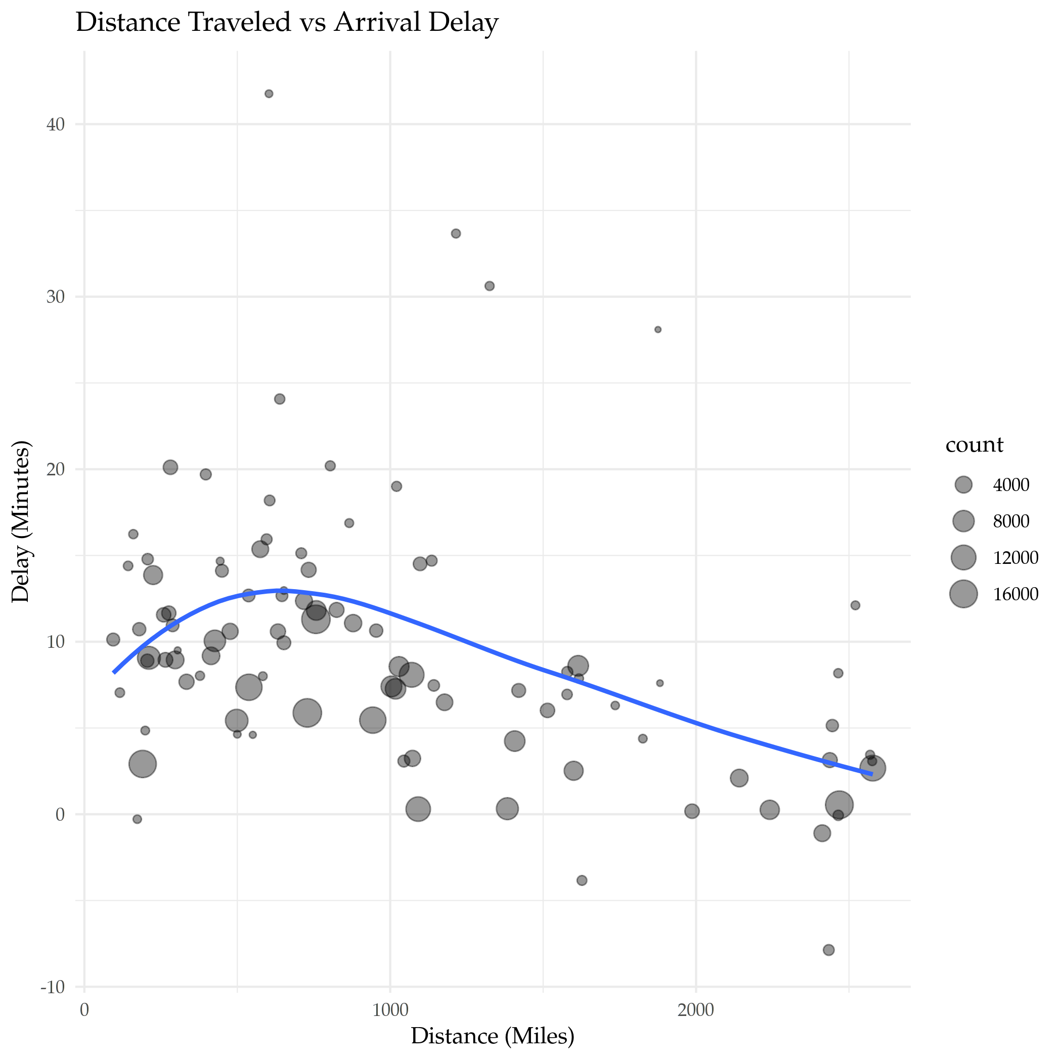
Note that we're using the mean here, not the median, so there's going to be more variation because of all the outliers. Also, because there are some missing values we had to tell the mean function to ignore them - otherwise the default is to return NA if any values are missing. There weren't any missing distance rows, but passing that argument in doesn't do any harm, I don't think. Now let's plot it.

plot = ggplot(data=delays_vs_distance, mapping=aes(x=distance, y=delay)) +
  geom_point(aes(size=count), alpha=0.4) +
  geom_smooth(se=FALSE) +
  labs(title="Distance Traveled vs Arrival Delay", x="Distance (Miles)",
       y="Delay (Minutes)")

ggsave("distance_vs_delay.png")
nil

It looks like up to a point the further you travel the worse the delay, and then it starts going in the opposite direction, with longer flights having shorter delays in their arrival times.

Link Collection

R For Data Science

Table Of Contents

  • Preface
  • Explore
    • Data Visualization with GGPlot2
    • Workflow: Basics
    • Data Transformation With DPlyr
    • Workflow: Scripts
    • Exploratory Data Analysis
    • Workflow: Projects
  • Wrangle
    • Tibbles With Tibble
    • Data Import With Readr
    • Tidy Data With Tidyr
    • Relational Data With Dplyr
    • Strings With Stringr
    • Factors With Forcats
    • Dates and Times With Lubridate
  • Program
    • Pipes With Magrittr
    • Functions
    • Vectors
    • Iterations With Purrr
  • Model
    • Model Basics With Modelr
    • Model Building
    • Many Models With Purrr and Broom
  • Communicate
    • R Markdown
    • Graphics For Communication With GGPlot2
    • R Markdown Formats
    • R Markdown Workflow

Links

Citation

  • [RFDS] Wickham H, Grolemund G. R for data science: import, tidy, transform, visualize, and model data. First edition. Sebastopol, CA: O’Reilly; 2016. 492 p.

A Look At ggplot

Introduction

This is a quick walk-through of some aspects of ggplot2 based on the first chapter of {% doc %}r-for-data-science{% /doc %}.

Set Up Stuff

Imports

Note: When you run the first code block to start the session, remember to give it the path to the posts-output folder so you don't need the path when saving the plots.

library("assertthat")
library("ggplot2")
library("knitr")
library("tidyverse")

Constants

These are stuff that get re-used in the plotting.

DISPLACEMENT <- "Engine Displacement (Liters)"
EFFICIENCY <-"Gallons Per Mile (Combined)"
DISPLACEMENT_VS_EFFICIENCY = partial(labs, x=DISPLACEMENT, y=EFFICIENCY)

BLUE <- "#4687b7"
RED <- "#ce7b6d"

The GGPlot2 Theme

theme_set(theme_minimal(base_family="Palatino"))

The MPG Dataset

For some reason loading ggplot2 also loads this dataset. Its short description is "Fuel economy data from 1999 to 2008 for 38 popular models of cars". The long description:

This dataset contains a subset of the fuel economy data that the EPA makes available on <URL: https://fueleconomy.gov/>. It contains only models which had a new release every year between 1999 and 2008 - this was used as a proxy for the popularity of the car.

The Variables

It's a data frame with 234 rows and 11 variables:

Variable Description
manufacturer manufacturer name
model model name
displ engine displacement, in litres
year year of manufacture
cyl number of cylinders
trans type of transmission
drv drive train (listed below)
cty city miles per gallon
hwy highway miles per gallon
fl fuel type
class "type" of car

I'll do some column renaming here since I keep forgetting what abbreviations they used.

Renaming Some Columns

mpg <- mpg %>%
  rename(
    displacement=displ,
    cylinders=cyl,
    transmission=trans,
    drive_train=drv,
    city_mpg=cty,
    highway_mpg=hwy,
    fuel_type=fl,
    )

str(mpg)
tibble [234 × 11] (S3: tbl_df/tbl/data.frame)
 $ manufacturer: chr [1:234] "audi" "audi" "audi" "audi" ...
 $ model       : chr [1:234] "a4" "a4" "a4" "a4" ...
 $ displacement: num [1:234] 1.8 1.8 2 2 2.8 2.8 3.1 1.8 1.8 2 ...
 $ year        : int [1:234] 1999 1999 2008 2008 1999 1999 2008 1999 1999 2008 ...
 $ cylinders   : int [1:234] 4 4 4 4 6 6 6 4 4 4 ...
 $ transmission: chr [1:234] "auto(l5)" "manual(m5)" "manual(m6)" "auto(av)" ...
 $ drive_train : chr [1:234] "f" "f" "f" "f" ...
 $ city_mpg    : int [1:234] 18 21 20 21 16 18 18 18 16 20 ...
 $ highway_mpg : int [1:234] 29 29 31 30 26 26 27 26 25 28 ...
 $ fuel_type   : chr [1:234] "p" "p" "p" "p" ...
 $ class       : chr [1:234] "compact" "compact" "compact" "compact" ...

Looking at the Data

kable(head(mpg), caption="MPG Dataset (EPA Automobile Data)")

Table: MPG Dataset (EPA Automobile Data)

manufacturer model displacement year cylinders transmission drive_train city_mpg highway_mpg fuel_type class
audi a4 1.8 1999 4 auto(l5) f 18 29 p compact
audi a4 1.8 1999 4 manual(m5) f 21 29 p compact
audi a4 2.0 2008 4 manual(m6) f 20 31 p compact
audi a4 2.0 2008 4 auto(av) f 21 30 p compact
audi a4 2.8 1999 6 auto(l5) f 16 26 p compact
audi a4 2.8 1999 6 manual(m5) f 18 26 p compact

Some Renaming

The Drive Trains

Abbreviation Meaning
f Front-Wheel Drive
r Rear-Wheel Drive
4 Four-Wheel Drive

These aren't too obscure, but I think I'll rename them anyway.

mpg$drive_train <- recode(mpg$drive_train,
                          f="Front-Wheel", r="Rear-Wheel", `4`="Four-Wheel" )
kable(unique(mpg$drive_train), col.names=c("Drives"))
Drives
Front-Wheel
Four-Wheel
Rear-Wheel
assert_that(noNA(mpg$drive_train))

Fuel Types

Although this is about ggplot2, and the data is sort of a side effect, since I had to look some of this data up to figure out what it meant (at fueleconomy.gov) I'll use this opportunity to document it by updating the data.

mpg$fuel_type <- recode(mpg$fuel_type,
                        p="Premium Unleaded",
                        r="Regular Unleaded",
                        e="Ethanol",
                        d="Diesel Fuel",
                        c="Compressed Natural Gas")

kable(unique(mpg$fuel_type), col.names = c("Fuel Type"))
Fuel Type
Premium Unleaded
Regular Unleaded
Ethanol
Diesel Fuel
Compressed Natural Gas

For some reason I couldn't find a table that directly mapped to the data set so I'm sort of guessing that this is what they stood for based on the 1999 guide on their download page. There's also a L for Liquified Petroleum Gas (Propane) in the guide but it's not in the data set.

assert_that(noNA(mpg$fuel_type))

Transmission

mpg$transmission <- recode(mpg$transmission,
                           `auto(av)`="Continuously Variable",
                           `auto(s4)`="Automatic 4-Speed",
                           `auto(s5)`="Automatic 5-Speed",
                           `auto(s6)`="Automatic 6-Speed",
                           `auto(l3)`="Automatic Lockup 3-Speed",
                           `auto(l4)`="Automatic Lockup 4-Speed",
                           `auto(l5)`="Automatic Lockup 5-Speed",
                           `auto(l6)`="Automatic Lockup 6-Speed",
                           `manual(m5)`="Manual 5-Speed",
                           `manual(m6)`="Manual 6-Speed"
                           )

kable(unique(mpg$transmission), col.names = c("Transmission"))
Transmission
Automatic Lockup 5-Speed
Manual 5-Speed
Manual 6-Speed
Continuously Variable
Automatic 6-Speed
Automatic Lockup 4-Speed
Automatic Lockup 3-Speed
Automatic Lockup 6-Speed
Automatic 5-Speed
Automatic 4-Speed

Strangely, there's no listing for 4-speed manual transmissions.

assert_that(noNA(mpg$transmission))

Displacement Vs Highway Mileage

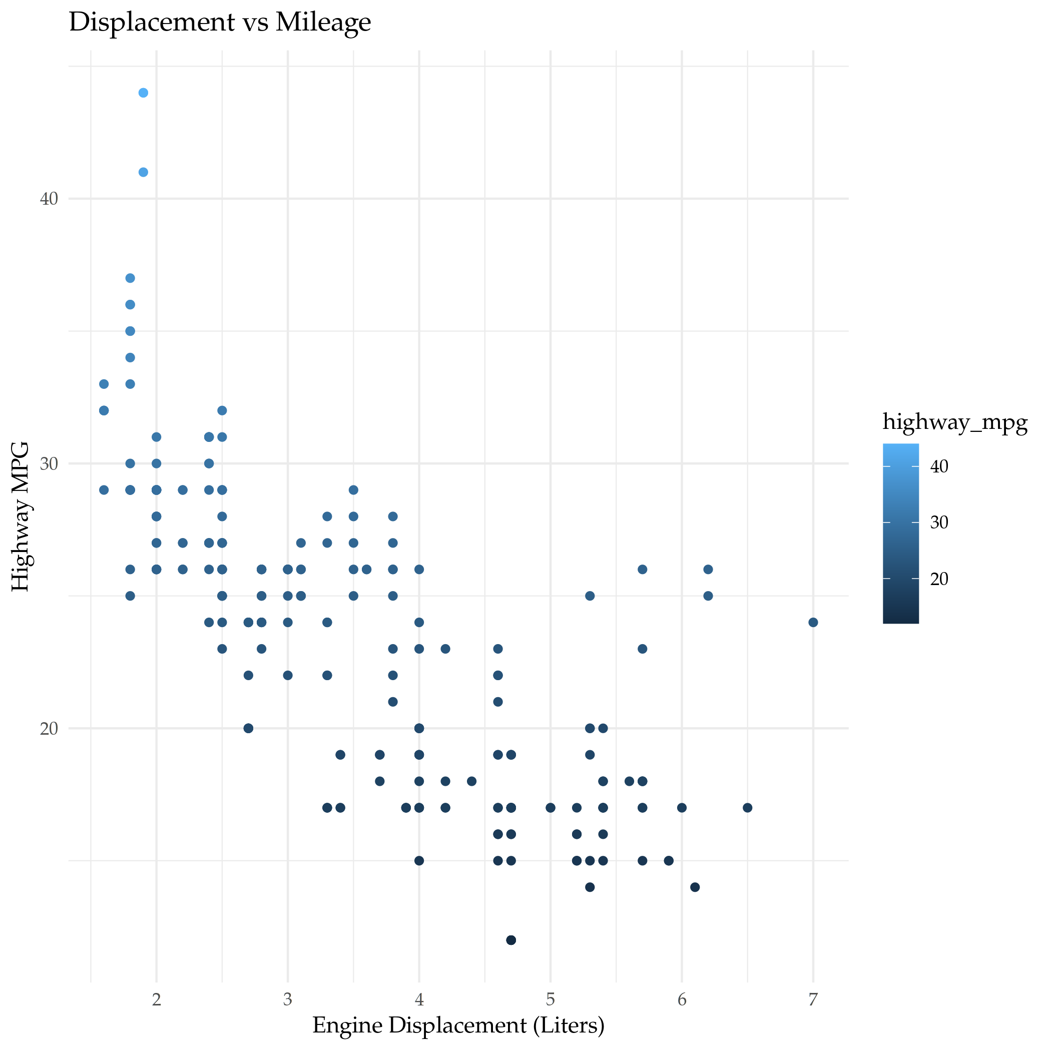
Now we come to the basic thing that the chapter in R For Data Science looks at (mostly) - what affects mileage for automobiles. The first thing we'll do is look at how the size of the engine affects the mileage.

plot = ggplot(data=mpg) +
  geom_point(mapping=aes(x=displacement, y=highway_mpg, color=highway_mpg)) +
  labs(x=DISPLACEMENT, y="Highway MPG",
       title="Displacement vs Mileage")

filename = "displacement_vs_mileage.png"
ggsave(filename)

nil

It has a roughly linear relationship, as you might expect, but the rest of this post is about how to get more information out of the data using ggplot2.

Ditching the Highway (Mileage)

Combined Mileage

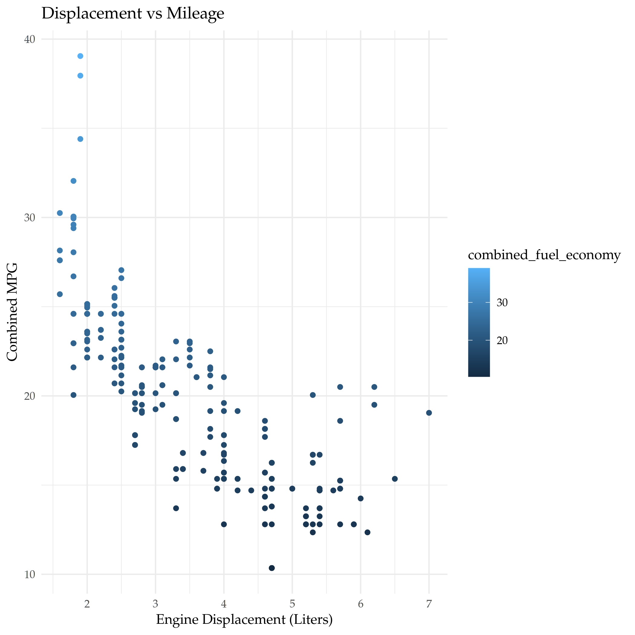
The EPA uses a weighted average to create a combined metric that uses both Highway and City mileage.

\[ \textrm{Combined Fuel Economy} = 0.55 \times \textit{city} + 0.45 \times \textit{highway} \]

I've also seen it done as the harmonic mean (on Illustrative Mathematics), but if you round to the nearest whole number it comes out about the same.

mpg$combined_fuel_economy <- 0.55 * mpg$city_mpg + 0.45 * mpg$highway_mpg

plot = ggplot(data=mpg) +
  geom_point(mapping=aes(x=displacement, y=combined_fuel_economy, color=combined_fuel_economy)) +
  labs(x=DISPLACEMENT, y="Combined MPG",
       title="Displacement vs Mileage")

filename = "displacement_vs_combined_mileage.png"
ggsave(filename)

nil

Comparing the Two

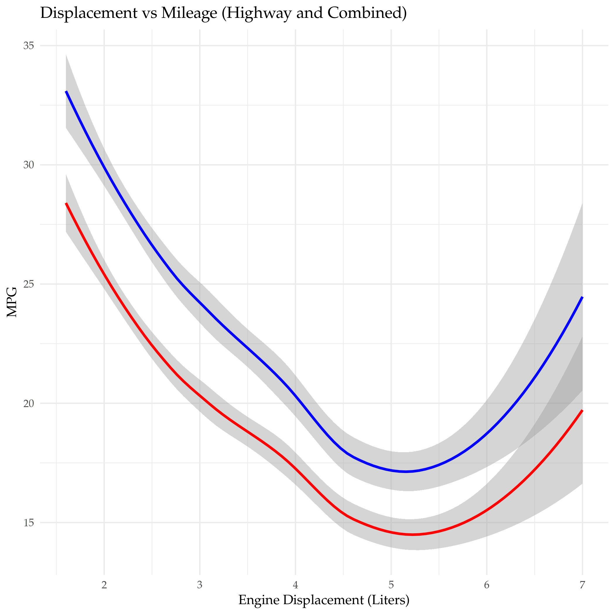
We can plot them together to see how much the combined MPG differs from the highway MPG.

plot = ggplot(data=mpg) +
  geom_smooth(mapping=aes(x=displacement, y=combined_fuel_economy), color="red") +
  geom_smooth(mapping=aes(x=displacement, y=highway_mpg), color="blue") +
  labs(x=DISPLACEMENT, y="MPG",
       title="Displacement vs Mileage (Highway and Combined)")

filename = "highway_vs_combined_mileage.png"
ggsave(filename)

nil

Adding the city mileage drops the mileage somewhat, although the line looks to be about the same shape.

Gallons Per Mile

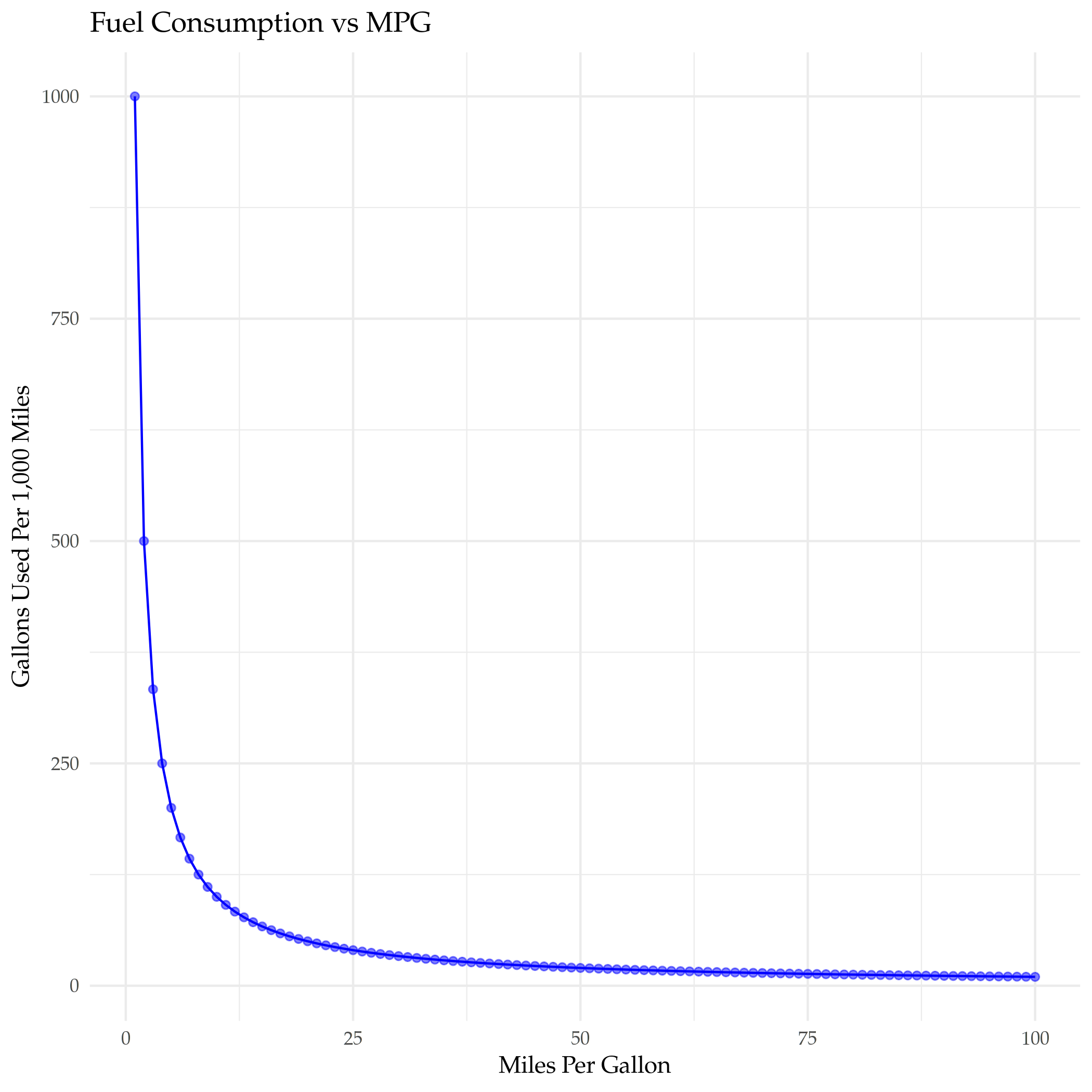
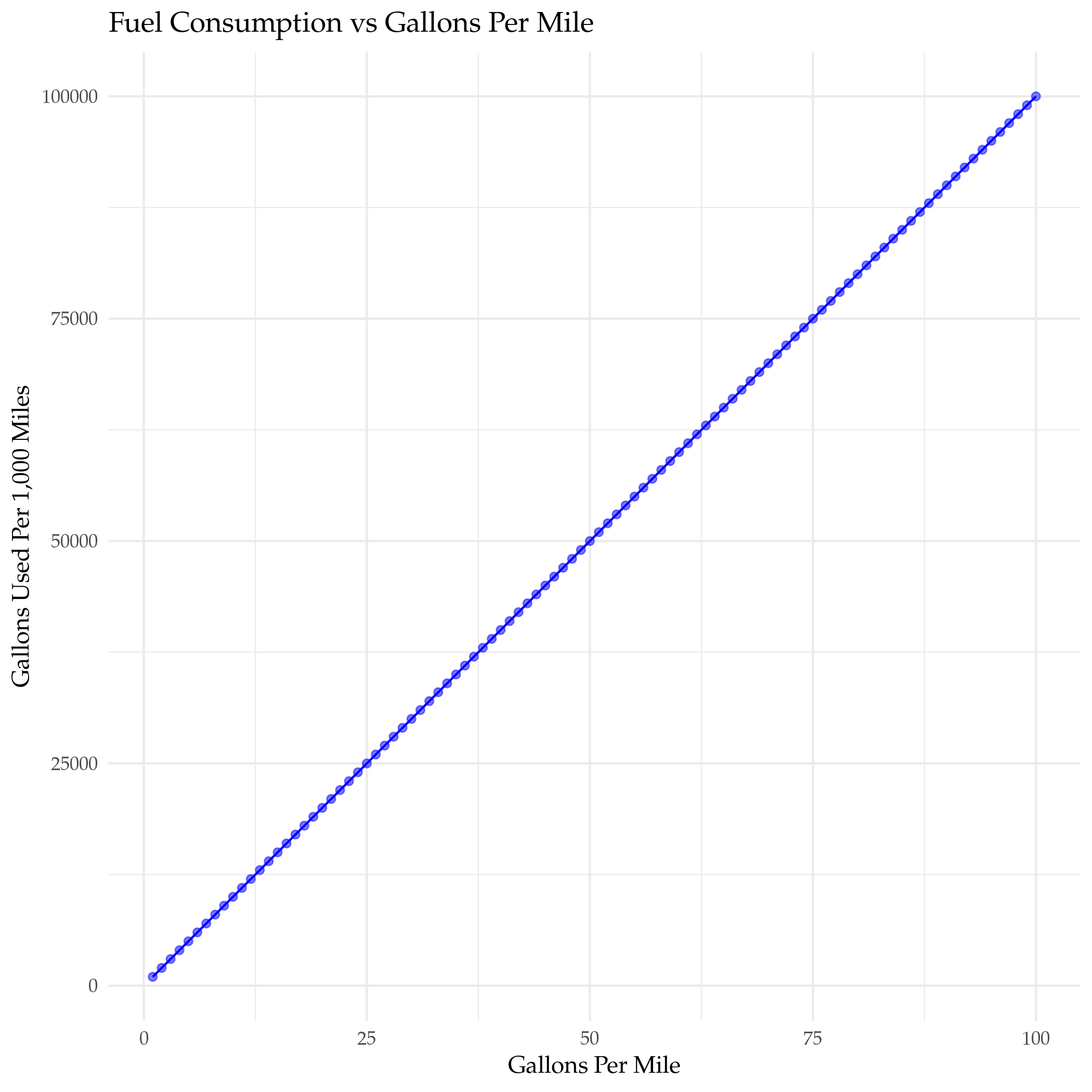
The EPA's explanation of their vehicle labels mentions that the reason why they put a Fuel Consumption Rate is that the Miles Per Gallon metric is actually not a good way to compare mileage - it is subject to a "Miles Per Gallon Illusion" (ReaClearScience has an article about it). Here's how the number of gallons used per 1,000 miles driven changes with miles-per-gallon.

mileage <- seq(1, 100)
miles = 1000
gallons_per_1000_miles <- miles/mileage

improvement <- data.frame(MPG=mileage,
                          gallons=gallons_per_1000_miles)
plot = ggplot(data=improvement) +
  geom_point(mapping=aes(x=mileage, y=gallons), alpha=0.5, color="blue") +
  geom_line(mapping=aes(x=mileage, y=gallons), color="blue") +
  labs(title="Fuel Consumption vs MPG",
       x="Miles Per Gallon",
       y="Gallons Used Per 1,000 Miles")

ggsave("gallons_vs_mpg.png")

nil

As you can see the improvement in the number of gallons used goes down pretty fast as the miles-per-gallon goes up. Let's see about adding a fuel-efficency column. What happens when you switch to Gallons Per Mile?

gallons_per_mile <- mileage
gallons_per_1000_miles <- miles * gallons_per_mile

improvement <- data.frame(gpm=gallons_per_mile,
                          gallons=gallons_per_1000_miles)
plot = ggplot(data=improvement) +
  geom_point(mapping=aes(x=gpm, y=gallons), alpha=0.5, color="blue") +
  geom_line(mapping=aes(x=gpm, y=gallons), color="blue") +
  labs(title="Fuel Consumption vs Gallons Per Mile",
       x="Gallons Per Mile",
       y="Gallons Used Per 1,000 Miles")

ggsave("gallons_vs_efficiency.png")

nil

I suppose you could just figure that that'd be the case, but this is about plotting.

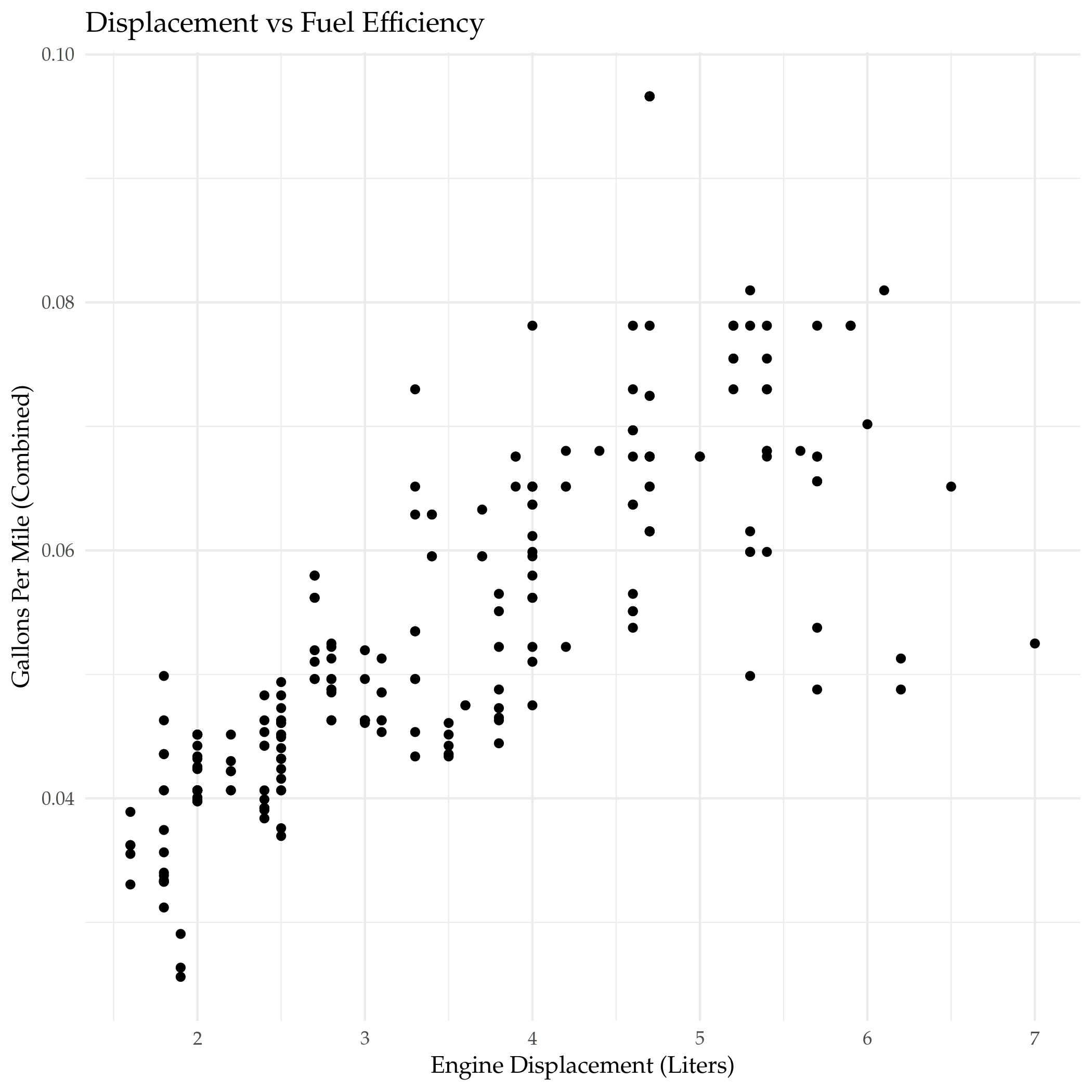
mpg$gallons_per_mile <- 1/mpg$combined_fuel_economy

plot = ggplot(data=mpg, mapping=aes(x=displacement, y=gallons_per_mile)) +
  geom_point() +
  DISPLACEMENT_VS_EFFICIENCY(title="Displacement vs Fuel Efficiency")

filename = "displacement_vs_fuel_efficiency.png"
ggsave(filename)

nil

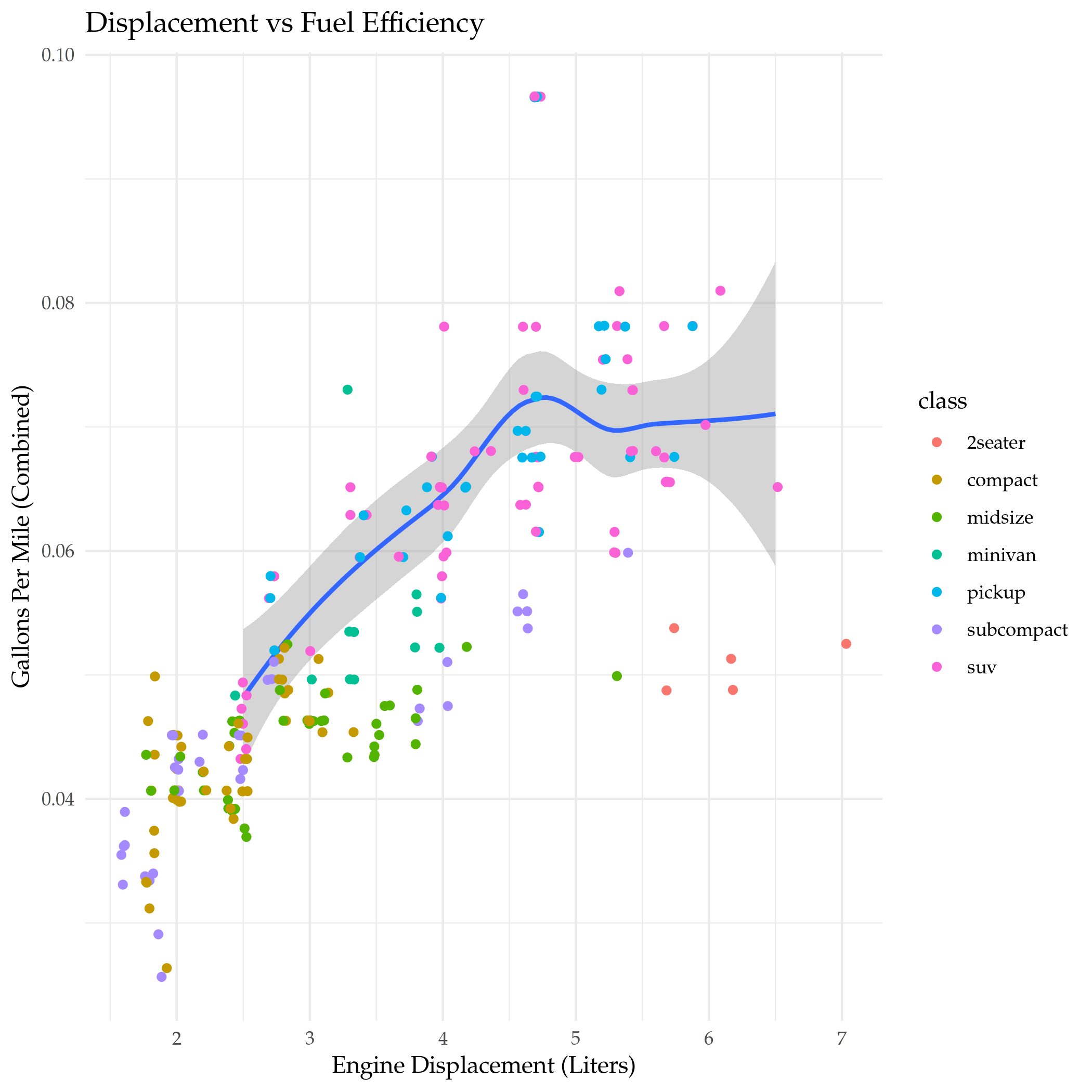
Even though this is just the inverse of the MPG plot it seems more intuitive to me. I didn't really notice that big outlier at the top when I plotted it using MPG, so I think I'll stick with this.

Displacement With Class

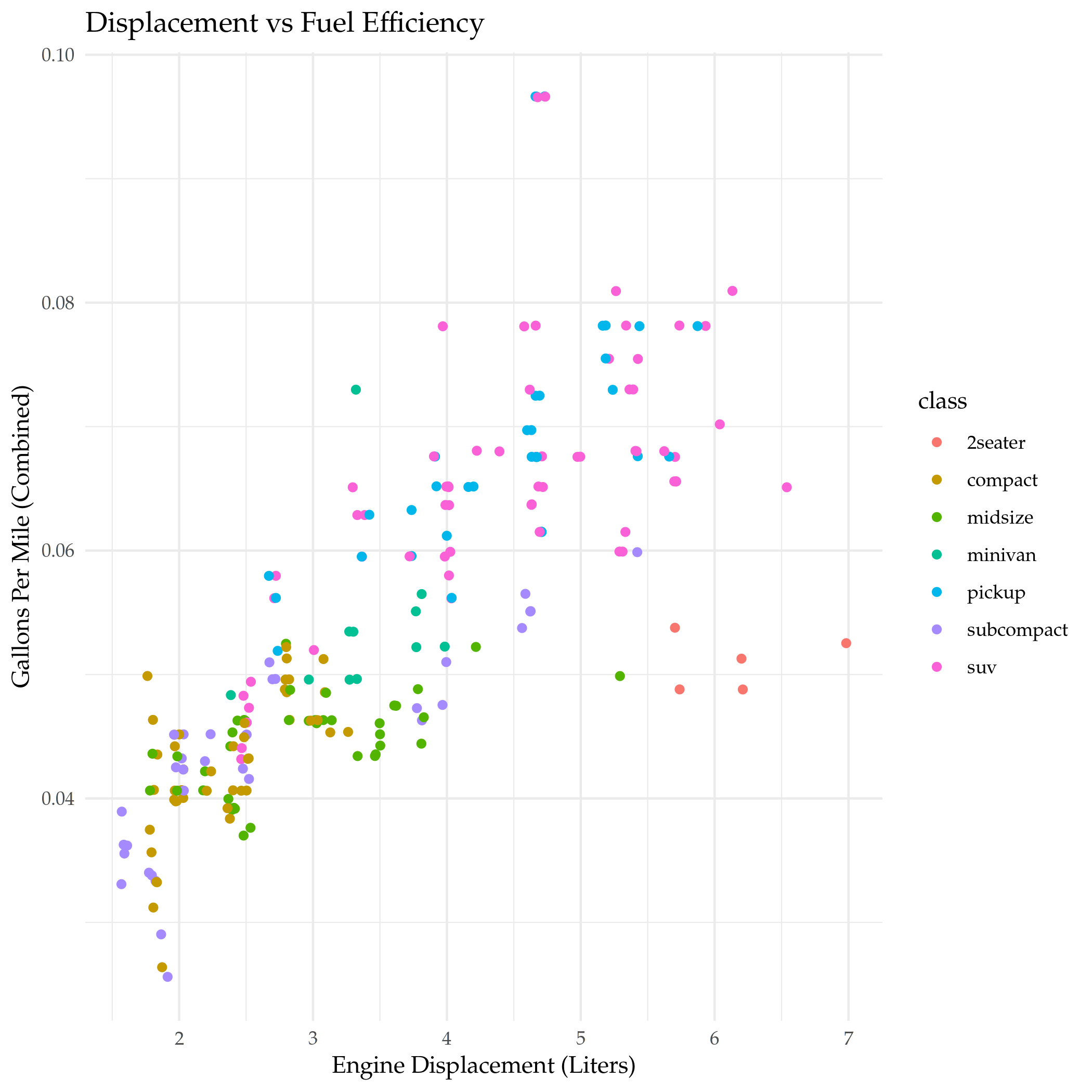
The displacement seems to mostly have a linear relationship with mileage, but there's exceptions, let's see if showing the class of the car reveals any interesting patterns.

unique(mpg$class)
[1] "compact"    "midsize"    "suv"        "2seater"    "minivan"   
[6] "pickup"     "subcompact"

Efficiency

plot = ggplot(data=mpg) +
  geom_point(mapping=aes(x=displacement, y=gallons_per_mile, color=class),
             position="jitter") +
  DISPLACEMENT_VS_EFFICIENCY(title="Displacement vs Fuel Efficiency")

filename = "displacement_vs_mileage_with_class.png"
ggsave(filename)

nil

I added a little jitter because it looked like the top outlier was just one point. It looks like 2-seaters and one of the mid-sized cars had unusually good mileage given their engine displacement. What's a two-seater?

kable(filter(mpg, class=="2seater"))
manufacturer model displacement year cylinders transmission drive_train city_mpg highway_mpg fuel_type class combined_fuel_economy gallons_per_mile
chevrolet corvette 5.7 1999 8 Manual 6-Speed Rear-Wheel 16 26 Premium Unleaded 2seater 20.50 0.0487805
chevrolet corvette 5.7 1999 8 Automatic Lockup 4-Speed Rear-Wheel 15 23 Premium Unleaded 2seater 18.60 0.0537634
chevrolet corvette 6.2 2008 8 Manual 6-Speed Rear-Wheel 16 26 Premium Unleaded 2seater 20.50 0.0487805
chevrolet corvette 6.2 2008 8 Automatic 6-Speed Rear-Wheel 15 25 Premium Unleaded 2seater 19.50 0.0512821
chevrolet corvette 7.0 2008 8 Manual 6-Speed Rear-Wheel 15 24 Premium Unleaded 2seater 19.05 0.0524934

Just Corvettes here.

Faceting The Classes

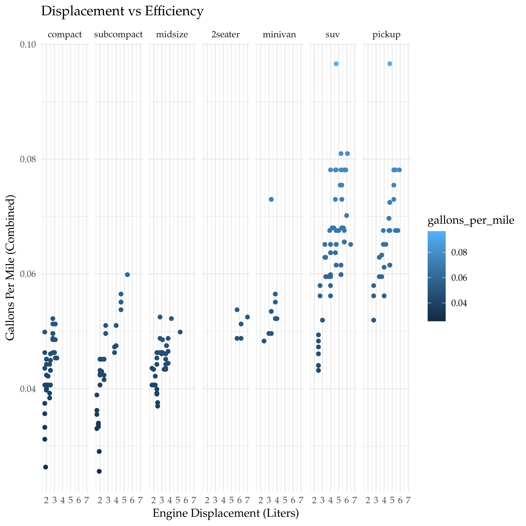
While the use of color is useful for comparing the classes on the same plot, sometimes it can be easier to interpret plots that have the categorical classes separated into sub-plots (called facets).

By default the faceting functions use aphabetical order, I'm going to use a slightly different ordering to see if it makes it clearer how the classes compare (this is based on the medians that I plotted below).

mpg$class_order <- factor(mpg$class,
                          levels=c("compact", "subcompact", "midsize",
                                   "2seater",
                                   "minivan", "suv", "pickup"))
plot = ggplot(data=mpg) +
  geom_point(mapping=aes(x=displacement, y=gallons_per_mile, color=gallons_per_mile)) +
  facet_grid(. ~ class_order) + 
  DISPLACEMENT_VS_EFFICIENCY(title="Displacement vs Efficiency")

filename = "displacement_vs_mileage_faceted_classes.png"
ggsave(filename)

I'm using facet_grid here, which is actually meant to use two variables (creating row and column separation). By putting the . before the ~ we're telling it to only facet using columns. There's also a facet_wrap function that only does one variable but adds the ability to specify the number of rows you want to use, which might be helpful if you have a lot of classes.

nil

I wouldn't have thought it, but the Corvette falls between the minivan and the sub-compact for fuel efficiency. I guess when you consider that it can only be used to transport two people and not anything relatively large it's still inefficient, just not as much if you're only using it to commute.

Smoothing the Line

Instead of plotting a scatterpoint, you can use geom_smooth to fit a single line representing the trend for the data (using a linear model).

plot = ggplot(data=mpg, mapping=aes(x=displacement, y=gallons_per_mile)) +
  geom_smooth() +
  geom_point() +
  facet_grid(class_order ~ drive_train) +
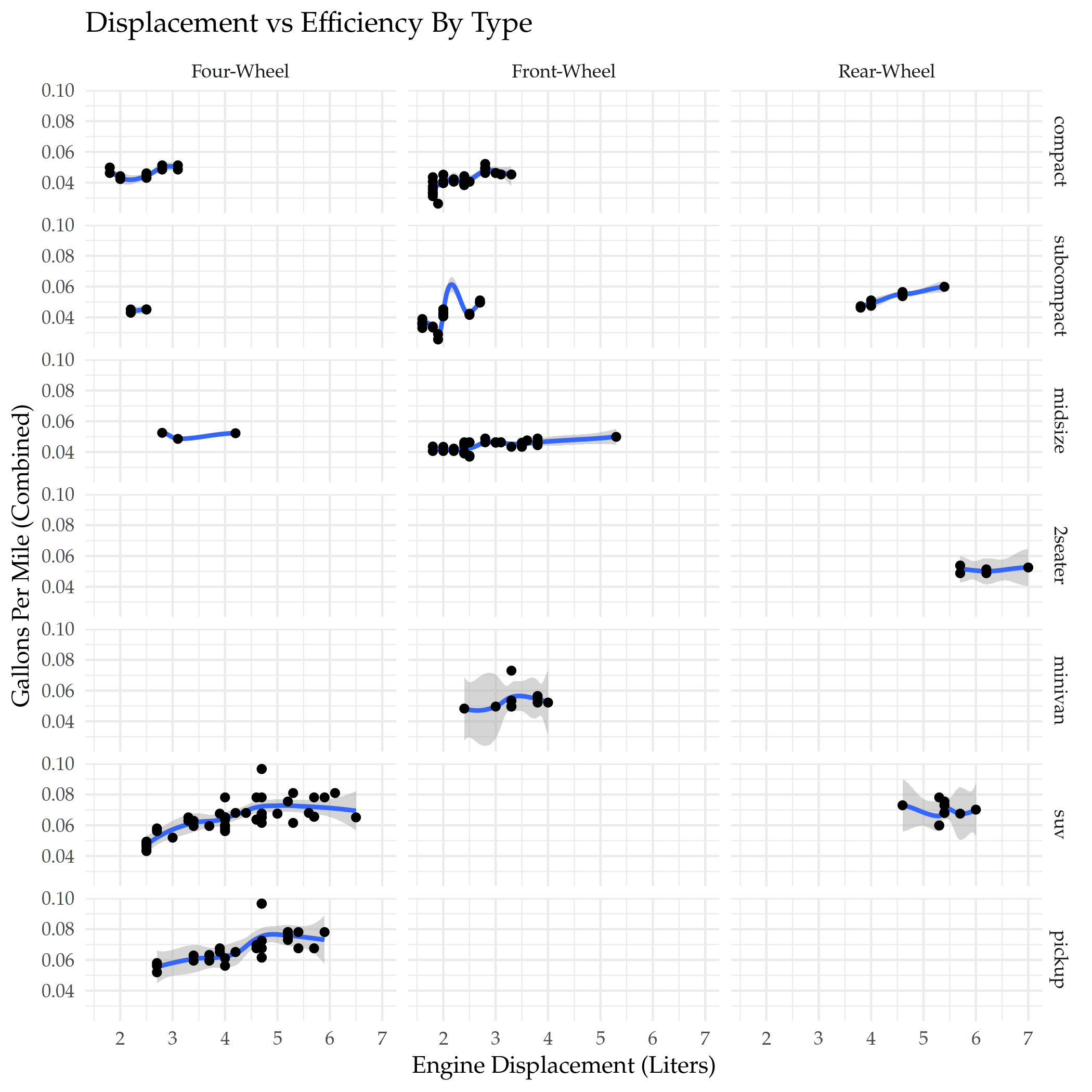
  DISPLACEMENT_VS_EFFICIENCY(title="Displacement vs Efficiency By Type")

ggsave("displacement_vs_mileage_smooth.png")

nil

One interesting thing here is that the four-wheel-drive compact and sub-compact cars did better than some of the front-wheel drive cars in the same class.

If you look at the front-wheel-drive sub-compact cars you'll see that the curve-fitting can get a little funky if you're not careful.

Note the syntax for the plot. Before we were passing the aes mapping to the geometry object. You can do that here too, but if you pass it to the ggplot call then it will automatically apply it to all the geometries. If you wanted to then change one of them you could pass in the aes mapping to it and override the base mapping you gave to ggplot.

Different Datasets to the Geometries

Besides passing in different aes mappings, you can also pass in different sub-sets of the data to each geometry (using dplyr's filter to isolate the SUVs here).

plot = ggplot(data=mpg, mapping=aes(x=displacement, y=gallons_per_mile)) +
  geom_smooth(data=filter(mpg, class=="suv")) +
  geom_point(mapping=aes(color=class), position="jitter") +
  DISPLACEMENT_VS_EFFICIENCY(title="Displacement vs Fuel Efficiency")

filename = "displacement_vs_mileage_subsets.png"
ggsave(filename)

nil

Looking at the trend-line for SUVs you can see that it encompasses a surprising swath of the displacements, and it is mostly upwardly linear to begin with but then flattens out.

plot = ggplot(
  data = mpg,
  mapping = aes(x = displacement, y = gallons_per_mile, color = drive_train)
) +
  geom_point() +
  geom_smooth(se = FALSE) +
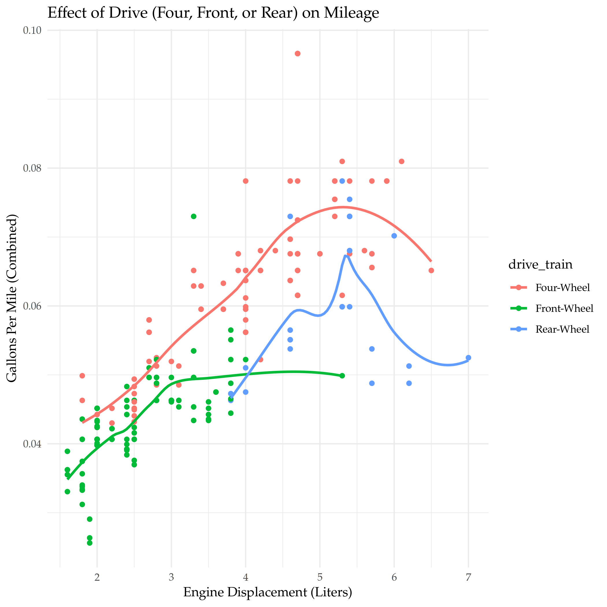
  DISPLACEMENT_VS_EFFICIENCY(title="Effect of Drive (Four, Front, or Rear) on Mileage")

ggsave("displacement_exercise_2.png")

nil

It kind of looks like an emerging pattern that up to a point gasoline consumption goes up with engine size but then once a certain point is passed consumption flattens out, even as the engines get bigger.

Small Four-Wheel Drive Automobiles

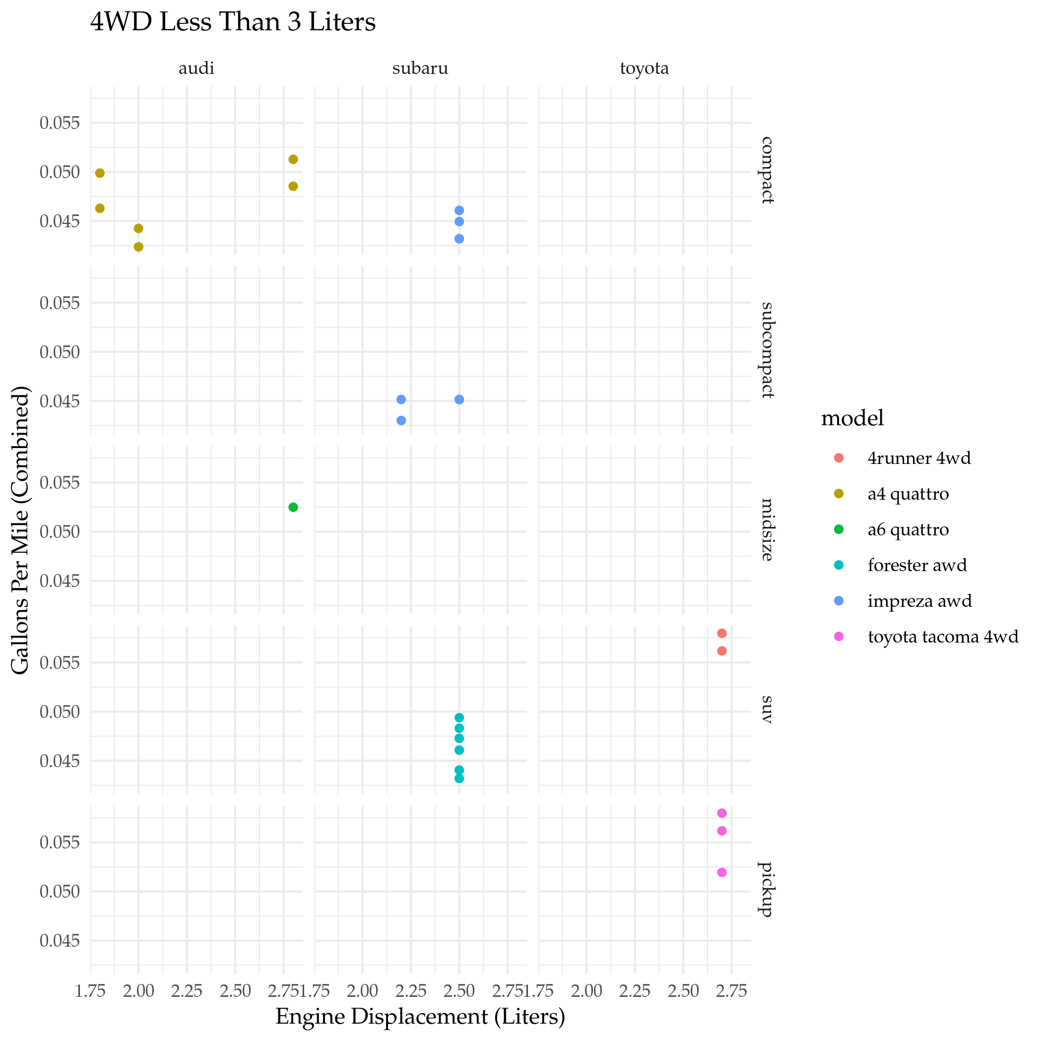
Just out of curiosity, I'd like to see what those small four-wheel drive cars are.

small <- filter(mpg, displacement<3 & drive_train=="Four-Wheel")
plot = ggplot(
  data=small,
  mapping=aes(x=displacement, y=gallons_per_mile, color=model)
) +
  geom_point() +
  facet_grid(class_order ~ manufacturer) +
  DISPLACEMENT_VS_EFFICIENCY(title="4WD Less Than 3 Liters")

ggsave("small_4wd.png")

nil

There are only three companies making these small four-wheel-drive automobiles, with Audi being the one focused on sedans.

Bar Plots

By Count

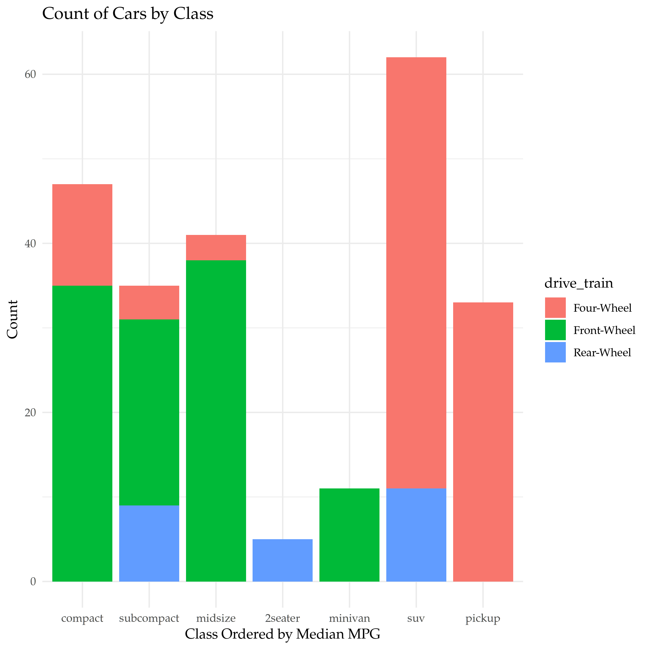
The Bar Plot is an example of what the Grammar of Graphics calls a Statistical Transformation (I guess the scatter plots are so called "Identity" transformations, but, whatever). It doesn't display the values in the data (unless you tell it to) but instead shows how often categorical values appear in the data. We can also have it set the color to create a stacked bar plot.

plot = ggplot(data=mpg) +
  geom_bar(
    mapping = aes(x=class_order, fill=drive_train)
  ) +
  labs(title="Count of Cars by Class", x="Class Ordered by Median MPG", y="Count")

ggsave("class_count.png")

nil

So most models of car are SUVs, how disheartening. This is only a sub-set of cars, though, and it doesn't reflect sales, just model counts.

By Proportion

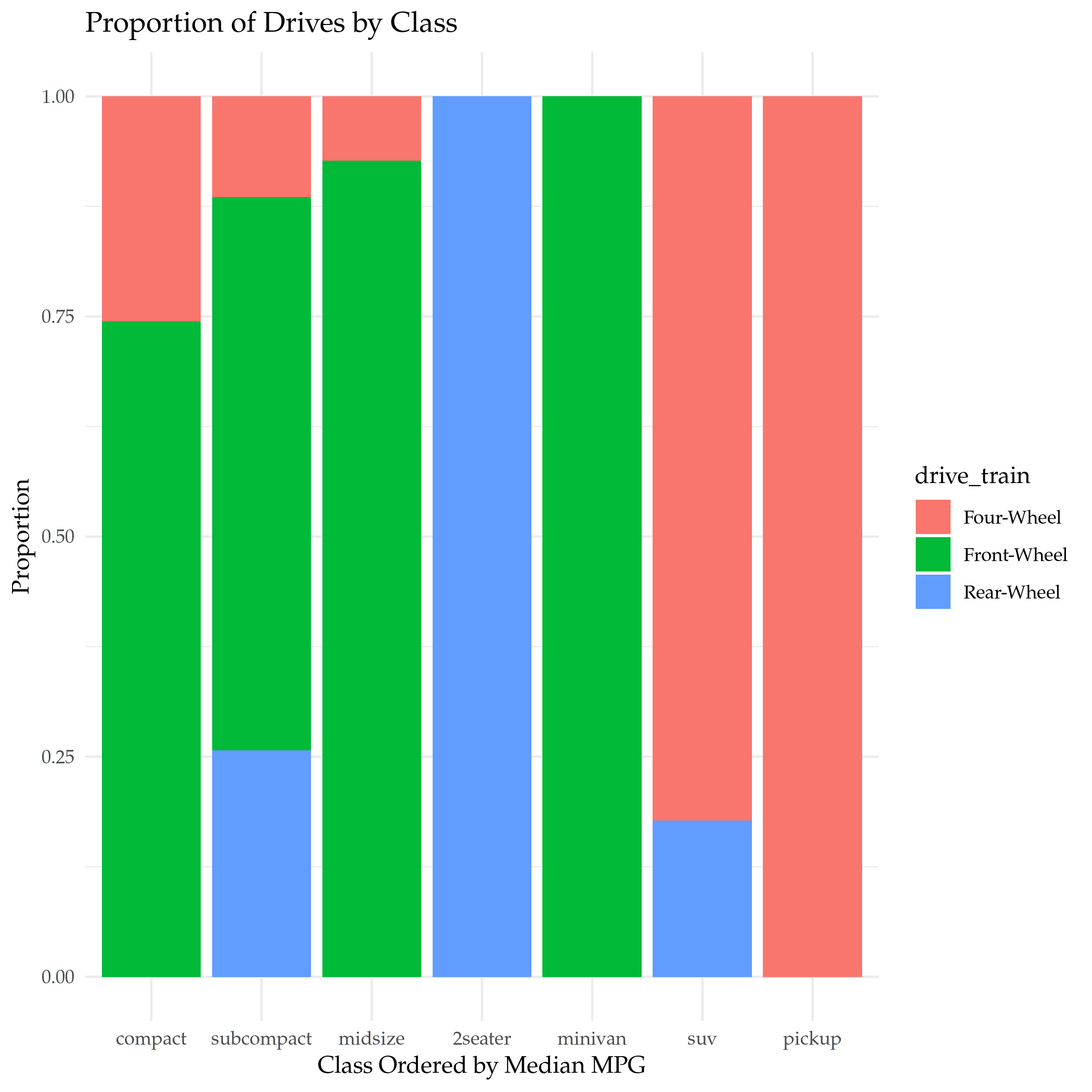
Instead of using counts we can use proportions to show how the sub-category portions compare across categories.

plot = ggplot(data=mpg) +
  geom_bar(
    mapping = aes(x=class_order, fill=drive_train),
    position="fill"
  ) +
  labs(title="Proportion of Drives by Class", x="Class Ordered by Median MPG", y="Proportion")

ggsave("class_count_filled.png")

nil

This shows what proportion if each class of car has what type of drive.

Un-Stacked

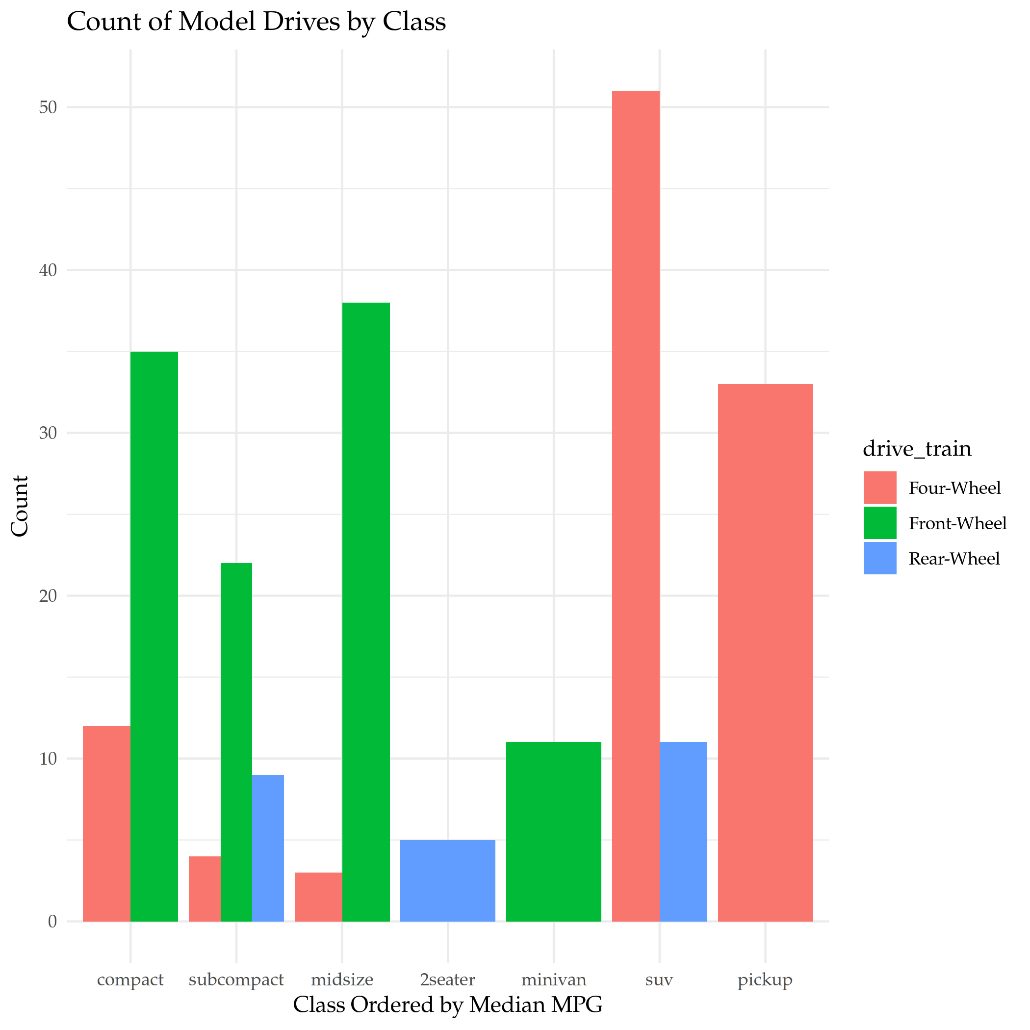
To make it easier to see how sub-categories compare within the class, we can change the positioning so that the bars are put side-by-side.

plot = ggplot(data=mpg) +
  geom_bar(
    mapping = aes(x=class_order, fill=drive_train),
    position="dodge"
  ) +
  labs(title="Count of Model Drives by Class", x="Class Ordered by Median MPG", y="Count")

ggsave("class_count_dodged.png")

nil

Proportions Not Counts

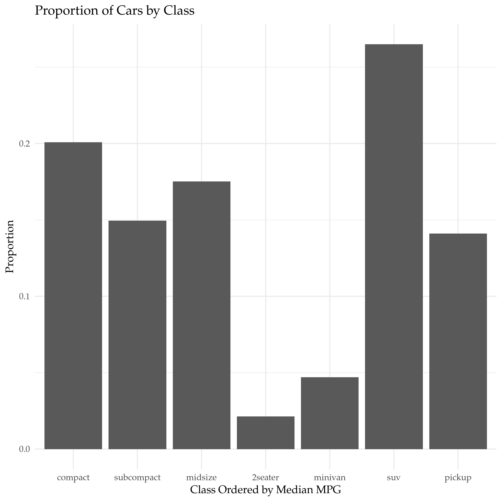
Our original bar graph showed the counts, but we can show the same plot using the proportion that each categories' count is of the total count as the y-axis.

plot = ggplot(data=mpg, mapping=aes(color=class)) +
  geom_bar(
    mapping = aes(x=class_order, y=..prop.., group=1)
  ) +
  labs(title="Proportion of Cars by Class", x="Class Ordered by Median MPG", y="Proportion")

ggsave("class_proportion.png")

nil

Two things:

  • That funky ..prop.. is really how R specifies that argument
  • The group=1 argument tells ggplot that there's only one group for the whole dataset, otherwise each category is taken as a separate group and they are all end up as 100% of their group.
  • I couldn't get ggplot to set the colors based on the class

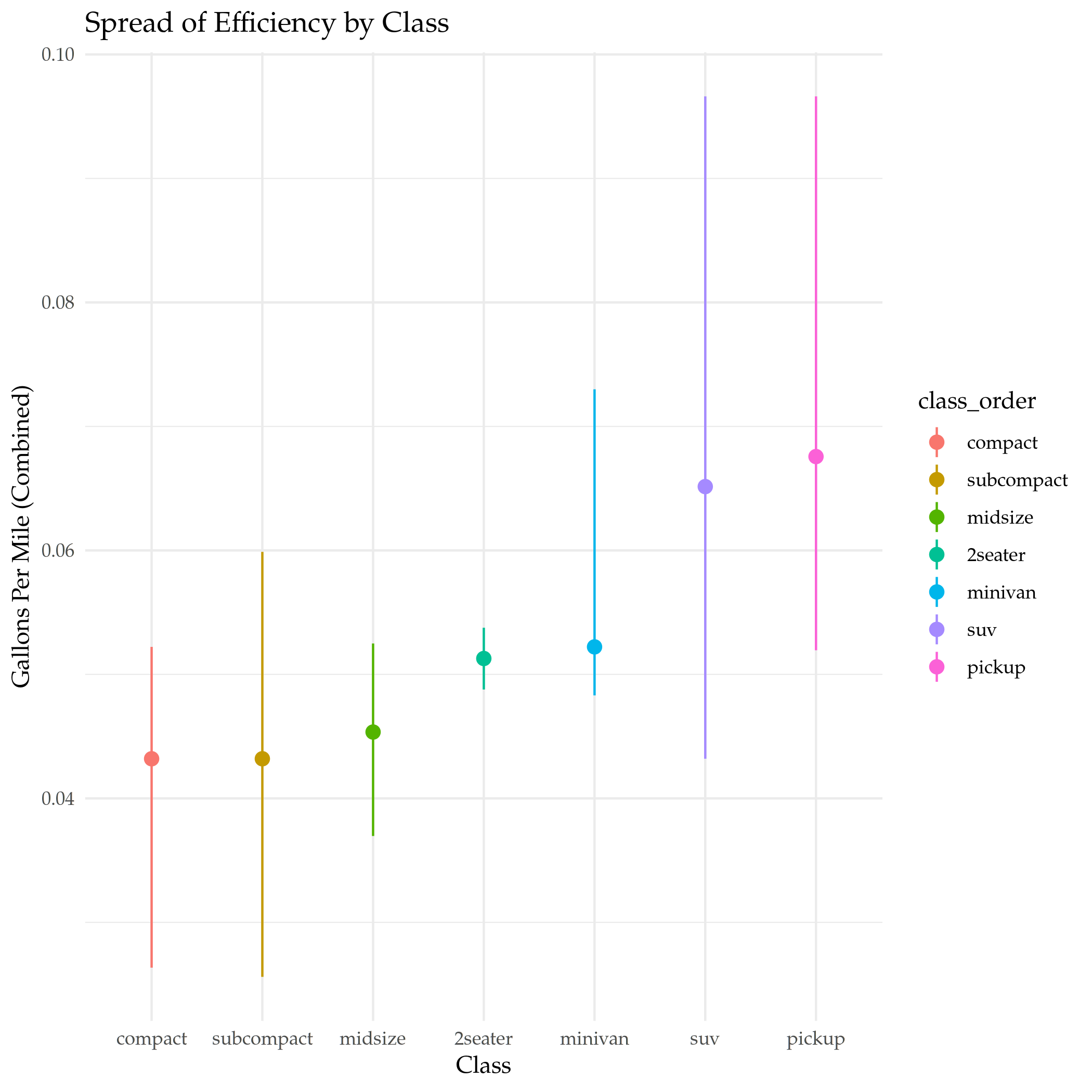
Stat Summary

This is a way to plot different kinds of summary statistics for the dataset.

plot = ggplot(data=mpg) +
  stat_summary(
    mapping = aes(x=class_order, y=gallons_per_mile, color=class_order),
    fun.min = min,
    fun.max = max,
    fun = median
  ) +
  labs(title="Spread of Efficiency by Class", y=EFFICIENCY, x="Class")

ggsave("mpg_class_spread.png")

nil

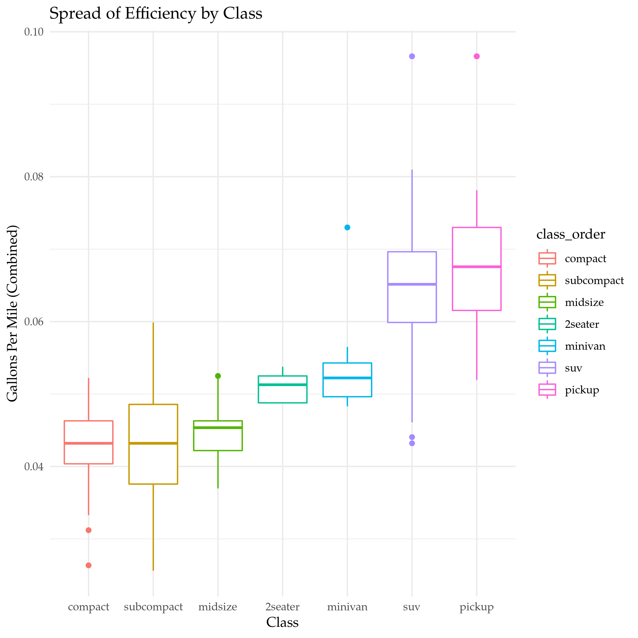
Boxplot

That was a nice clean way to show it, and it's flexible, but maybe a good old-fashioned box-plot is the best, in the end.

plot = ggplot(data=mpg) +
  geom_boxplot(
    mapping = aes(x=class_order, y=gallons_per_mile, color=class_order),
  ) +
  labs(title="Spread of Efficiency by Class", y=EFFICIENCY, x="Class")

ggsave("mpg_class_boxplot.png")

nil

The End

Well, that's more than enough of that. The Chapter in R For Data Science has other stuff in there, in particular there's a section on changing the coordinate system, but I think it's time to move on.

Link Collection

NYPD Shooting Incident Data

NYPD Shooting Incident Data

This is a project that looks at the NYPD Shooting Incident Data (Historic) from the DATA.gov catalog of datasets. This dataset lists every shooting incident in New York City from 2006 through the end of the previous calendar year. It is compiled by NYC Open Data and was last updated on December 11, 2021.

Each row in the data is a "shooting incident" and there are 19 columns.

Loading the Data

library(assertthat)
library(knitr)
library(lubridate)
library(tidyverse)

Lubridate is part of the tidyverse but it has to be loaded for some reason.

DATA_URL <- "https://data.cityofnewyork.us/api/views/833y-fsy8/rows.csv?accessType=DOWNLOAD" 

data = read_csv(DATA_URL)

[1mindexed[0m [32m0B[0m in [36m 0s[0m, [32m0B/s[0m
[1mindexed[0m [32m393.21kB[0m in [36m 0s[0m, [32m983.15kB/s[0m
                                                                              
[1mindexed[0m [32m524.28kB[0m in [36m 1s[0m, [32m1.03MB/s[0m
[1mindexed[0m [32m655.36kB[0m in [36m 1s[0m, [32m1.22MB/s[0m
[1mindexed[0m [32m786.43kB[0m in [36m 1s[0m, [32m1.24MB/s[0m
[1mindexed[0m [32m917.50kB[0m in [36m 1s[0m, [32m1.23MB/s[0m
                                                                              
[1mindexed[0m [32m1.05MB[0m in [36m 1s[0m, [32m1.18MB/s[0m
[1mindexed[0m [32m1.18MB[0m in [36m 1s[0m, [32m1.18MB/s[0m
[1mindexed[0m [32m1.31MB[0m in [36m 1s[0m, [32m1.06MB/s[0m
[1mindexed[0m [32m1.44MB[0m in [36m 2s[0m, [32m947.54kB/s[0m
                                                                              
[1mindexed[0m [32m1.57MB[0m in [36m 2s[0m, [32m1.00MB/s[0m
[1mindexed[0m [32m1.70MB[0m in [36m 2s[0m, [32m1.04MB/s[0m
[1mindexed[0m [32m1.83MB[0m in [36m 2s[0m, [32m1.04MB/s[0m
[1mindexed[0m [32m1.97MB[0m in [36m 2s[0m, [32m1.02MB/s[0m
[1mindexed[0m [32m2.10MB[0m in [36m 2s[0m, [32m1.03MB/s[0m
[1mindexed[0m [32m2.23MB[0m in [36m 2s[0m, [32m994.69kB/s[0m
[1mindexed[0m [32m2.36MB[0m in [36m 2s[0m, [32m965.18kB/s[0m
[1mindexed[0m [32m2.49MB[0m in [36m 3s[0m, [32m939.81kB/s[0m
[1mindexed[0m [32m2.62MB[0m in [36m 3s[0m, [32m951.26kB/s[0m
[1mindexed[0m [32m2.75MB[0m in [36m 3s[0m, [32m919.65kB/s[0m
[1mindexed[0m [32m2.88MB[0m in [36m 3s[0m, [32m855.66kB/s[0m
[1mindexed[0m [32m3.01MB[0m in [36m 3s[0m, [32m892.99kB/s[0m
[1mindexed[0m [32m3.15MB[0m in [36m 3s[0m, [32m904.11kB/s[0m
[1mindexed[0m [32m3.28MB[0m in [36m 4s[0m, [32m867.67kB/s[0m
[1mindexed[0m [32m3.41MB[0m in [36m 4s[0m, [32m878.71kB/s[0m
[1mindexed[0m [32m3.54MB[0m in [36m 4s[0m, [32m888.47kB/s[0m
[1mindexed[0m [32m3.67MB[0m in [36m 4s[0m, [32m899.43kB/s[0m
[1mindexed[0m [32m3.80MB[0m in [36m 4s[0m, [32m846.12kB/s[0m
[1mindexed[0m [32m3.93MB[0m in [36m 5s[0m, [32m861.49kB/s[0m
[1mindexed[0m [32m4.06MB[0m in [36m 5s[0m, [32m876.08kB/s[0m
[1mindexed[0m [32m4.19MB[0m in [36m 5s[0m, [32m854.40kB/s[0m
[1mindexed[0m [32m4.33MB[0m in [36m 5s[0m, [32m877.77kB/s[0m
[1mindexed[0m [32m4.46MB[0m in [36m 5s[0m, [32m855.56kB/s[0m
[1mindexed[0m [32m4.59MB[0m in [36m 5s[0m, [32m865.02kB/s[0m
[1mindexed[0m [32m4.72MB[0m in [36m 6s[0m, [32m855.32kB/s[0m
[1mindexed[0m [32m4.85MB[0m in [36m 6s[0m, [32m847.74kB/s[0m
[1mindexed[0m [32m4.98MB[0m in [36m 6s[0m, [32m870.08kB/s[0m
[1mindexed[0m [32m5.11MB[0m in [36m 6s[0m, [32m892.61kB/s[0m
[1mindexed[0m [32m5.11MB[0m in [36m 6s[0m, [32m892.93kB/s[0m
[1mindexed[0m [32m1.00TB[0m in [36m 6s[0m, [32m174.56GB/s[0m
                                                                              
[1mRows: [22m[34m23585[39m [1mColumns: [22m[34m19[39m
[36m──[39m [1mColumn specification[22m [36m──────────────────────────────────────────────────────────────────────────────[39m
[1mDelimiter:[22m ","
[31mchr[39m  (10): OCCUR_DATE, BORO, LOCATION_DESC, PERP_AGE_GROUP, PERP_SEX, PERP_R...
[32mdbl[39m   (7): INCIDENT_KEY, PRECINCT, JURISDICTION_CODE, X_COORD_CD, Y_COORD_CD...
[33mlgl[39m   (1): STATISTICAL_MURDER_FLAG
[34mtime[39m  (1): OCCUR_TIME

[36mℹ[39m Use [30m[47m[30m[47m`spec()`[47m[30m[49m[39m to retrieve the full column specification for this data.
[36mℹ[39m Specify the column types or set [30m[47m[30m[47m`show_col_types = FALSE`[47m[30m[49m[39m to quiet this message.

Tidying and Transforming the Data

spec(data)
cols(
  INCIDENT_KEY = [32mcol_double()[39m,
  OCCUR_DATE = [31mcol_character()[39m,
  OCCUR_TIME = [34mcol_time(format = "")[39m,
  BORO = [31mcol_character()[39m,
  PRECINCT = [32mcol_double()[39m,
  JURISDICTION_CODE = [32mcol_double()[39m,
  LOCATION_DESC = [31mcol_character()[39m,
  STATISTICAL_MURDER_FLAG = [33mcol_logical()[39m,
  PERP_AGE_GROUP = [31mcol_character()[39m,
  PERP_SEX = [31mcol_character()[39m,
  PERP_RACE = [31mcol_character()[39m,
  VIC_AGE_GROUP = [31mcol_character()[39m,
  VIC_SEX = [31mcol_character()[39m,
  VIC_RACE = [31mcol_character()[39m,
  X_COORD_CD = [32mcol_double()[39m,
  Y_COORD_CD = [32mcol_double()[39m,
  Latitude = [32mcol_double()[39m,
  Longitude = [32mcol_double()[39m,
  Lon_Lat = [31mcol_character()[39m
)

Incident Key

According to the Data Description the "Incident Key" is a randomly generated identifier for the incident. This is a likely candidate to remove unless we look at specific incidents.

Occur Date

This is the date that the shooting happened. It was loaded as a string so we should convert it to a date.

data$OCCUR_DATE[1]
[1] "08/27/2006"
data$DATE <- as.Date(data$OCCUR_DATE, format="%m/%d/%Y")
str(data$DATE)
data$DATE[1]
assert_that(noNA(data$DATE))
 Date[1:23585], format: "2006-08-27" "2011-03-11" "2019-10-06" "2011-09-04" "2013-05-27" ...
[1] "2006-08-27"
[1] TRUE

Occur Time

This is the time of the shooting. It appears to have already been read in as a time.

str(data$OCCUR_TIME)
assert_that(noNA(data$OCCUR_TIME))
 'hms' num [1:23585] 05:35:00 12:03:00 01:09:00 03:35:00 ...
 - attr(*, "units")= chr "secs"
[1] TRUE

Boro

This is the NYC Borough where the shooting happened.

data$Borough <- as.factor(data$BORO)
assert_that(is.factor(data$Borough))
assert_that(noNA(data$Borough))
[1] TRUE
[1] TRUE

knitr.kable reformats the dataframe to a more readable table. Kind of like tabulate but less flexible.

big_mark <- function(vector, columns){
    kable(table(vector), col.names=columns, format.args=list(big.mark=","))
}
big_mark(data$Borough, c("Borough", "Shootings"))
Borough Shootings
BRONX 6,701
BROOKLYN 9,734
MANHATTAN 2,922
QUEENS 3,532
STATEN ISLAND 696

Precinct

This is the precinct number where the shooting happened.

n_distinct(data$PRECINCT)
str(data$PRECINCT)
data$PRECINCT_FACTOR <- as.factor(data$PRECINCT)
see_if(noNA(data$PRECINCT))
[1] 77
 num [1:23585] 52 106 77 40 100 67 77 81 101 106 ...
[1] TRUE

Jurisdiction Code

The jurisdiction where the shooting occurred. There are three jurisdictions that are NYC jurisdictions:

Code Jurisdiction
0 Patrol
1 Transit
2 Housing

Any numbers higher than this are non-NYC jurisdictions.

data$JURISDICTION <- as.factor(data$JURISDICTION_CODE)
see_if(noNA(data$JURISDICTION))
[1] FALSE
attr(,"msg")
[1] "data$JURISDICTION contains 2 missing values"
big_mark(data$JURISDICTION, c("Jurisdiction", "Shootings"))
Jurisdiction Shootings
0 19,629
1 54
2 3,900

Location Description

data$LOCATION_DESC[1]
see_if(noNA(data$LOCATION_DESC))
[1] NA
[1] FALSE
attr(,"msg")
[1] "data$LOCATION_DESC contains 13581 missing values"
n_distinct(data$LOCATION_DESC)
[1] 40

Here's what the first filled-in entry looks like.

first(na.omit(data$LOCATION_DESC))
[1] "MULTI DWELL - PUBLIC HOUS"

Too bad there's so many missing values.

big_mark(data$LOCATION_DESC, c("Location", "Shootings"))
Location Shootings
ATM 1
BANK 1
BAR/NIGHT CLUB 562
BEAUTY/NAIL SALON 100
CANDY STORE 6
CHAIN STORE 5
CHECK CASH 1
CLOTHING BOUTIQUE 14
COMMERCIAL BLDG 234
DEPT STORE 5
DOCTOR/DENTIST 1
DRUG STORE 11
DRY CLEANER/LAUNDRY 30
FACTORY/WAREHOUSE 6
FAST FOOD 98
GAS STATION 53
GROCERY/BODEGA 574
GYM/FITNESS FACILITY 3
HOSPITAL 38
HOTEL/MOTEL 24
JEWELRY STORE 12
LIQUOR STORE 36
LOAN COMPANY 1
MULTI DWELL - APT BUILD 2,553
MULTI DWELL - PUBLIC HOUS 4,240
NONE 175
PHOTO/COPY STORE 1
PVT HOUSE 857
RESTAURANT/DINER 188
SCHOOL 1
SHOE STORE 9
SMALL MERCHANT 25
SOCIAL CLUB/POLICY LOCATI 66
STORAGE FACILITY 1
STORE UNCLASSIFIED 35
SUPERMARKET 19
TELECOMM. STORE 5
VARIETY STORE 11
VIDEO STORE 2

Statistical Murder Flag

This is a checkbox indicating that the victim died as a result of the shooting.

see_if(noNA(data$STATISTICAL_MURDER_FLAG))
[1] TRUE
big_mark(data$STATISTICAL_MURDER_FLAG, c("Victim Died", "Count"))
Victim Died Count
FALSE 19,085
TRUE 4,500

Perpetrator's Age Group

see_if(noNA(data$PERP_AGE_GROUP))
data$PERP_AGE <- as.factor(data$PERP_AGE_GROUP)
[1] FALSE
attr(,"msg")
[1] "data$PERP_AGE_GROUP contains 8295 missing values"
big_mark(data$PERP_AGE, c("Perpetrator's Age Group", "Shootings"))
Perpetrator's Age Group Shootings
<18 1,368
1020 1
18-24 5,508
224 1
25-44 4,714
45-64 495
65+ 54
940 1
UNKNOWN 3,148

Peprpetrator's Sex

There are three values for "Sex" - Female (F), Male (M), or Unknown (U).

see_if(noNA(data$PERP_SEX))
data$PERP_SEX <- as.factor(data$PERP_SEX)
[1] FALSE
attr(,"msg")
[1] "data$PERP_SEX contains 8261 missing values"
big_mark(data$PERP_SEX, c("Perpetrator's Sex", "Shootings"))
Perpetartor's Sex Shootings
F 335
M 13,490
U 1,499

Perpetrator's Race

see_if(noNA(data$PERP_RACE))
data$PERP_RACE <- as.factor(data$PERP_RACE)
[1] FALSE
attr(,"msg")
[1] "data$PERP_RACE contains 8261 missing values"
big_mark(data$PERP_RACE, c("Perpetrator's Race", "Shootings"))
Perpetrator's Race Shootings
AMERICAN INDIAN/ALASKAN NATIVE 2
ASIAN / PACIFIC ISLANDER 122
BLACK 10,025
BLACK HISPANIC 1,096
UNKNOWN 1,836
WHITE 255
WHITE HISPANIC 1,988

Victim's Age Group

see_if(noNA(data$VIC_AGE_GROUP))
data$VIC_AGE_GROUP <- as.factor(data$VIC_AGE_GROUP)
[1] TRUE
big_mark(data$VIC_AGE_GROUP, c("Victim's Age Group", "Shootings"))
Victim's Age Group Shootings
<18 2,525
18-24 9,003
25-44 10,303
45-64 1,541
65+ 154
UNKNOWN 59

Victim's Sex

see_if(noNA(data$VIC_SEX))
data$VIC_SEX <- as.factor(data$VIC_SEX)
[1] TRUE
big_mark(data$VIC_SEX, c("Victims' Sex", "Shootings"))
Victims' Sex Shootings
F 2,204
M 21,370
U 11

Victim's Race

see_if(noNA(data$VIC_RACE))
data$VIC_RACE <- as.factor(data$VIC_RACE)
[1] TRUE
big_mark(data$VIC_RACE, c("Victim's Race", "Shootings"))
Victim's Race Shootings
AMERICAN INDIAN/ALASKAN NATIVE 9
ASIAN / PACIFIC ISLANDER 327
BLACK 16,869
BLACK HISPANIC 2,245
UNKNOWN 65
WHITE 620
WHITE HISPANIC 3,450

X-Coordinate

"Midblock X-coordinate for New York State Plane Coordinate System, Long Island Zone, NAD 83, units feet (FIPS 3104)."

see_if(noNA(data$X_COORD_CD))
n_distinct(data$X_COORD_CD)
[1] TRUE
[1] 9911

Y-Coordinate

see_if(noNA(data$Y_COORD_CD))
n_distinct(data$Y_COORD_CD)
[1] TRUE
[1] 9986

Latitude

Latitude coordinate for Global Coordinate System, WGS 1984, decimal degrees (EPSG 4326).

see_if(noNA(data$Latitude))
n_distinct(data$Latitude)
[1] TRUE
[1] 10055

Longitude

Latitude coordinate for Global Coordinate System, WGS 1984, decimal degrees (EPSG 4326).

see_if(noNA(data$Longitude))
n_distinct(data$Longitude)
str(data$Longitude)
[1] TRUE
[1] 10055
 num [1:23585] -73.9 -73.8 -74 -73.9 -73.8 ...

Longitude and Latitude

Longitude and Latitude Coordinates for mapping

see_if(noNA(data$Lon_Lat))
n_distinct(data$Lon_Lat)
str(data$Lon_Lat)
[1] TRUE
[1] 10055
 chr [1:23585] "POINT (-73.87963173099996 40.86905819000003)" ...

Visualization

floor_date is a function from lubridate that comes as part of the tidyverse. It's called floor because it acts like the floor function in math (round down).

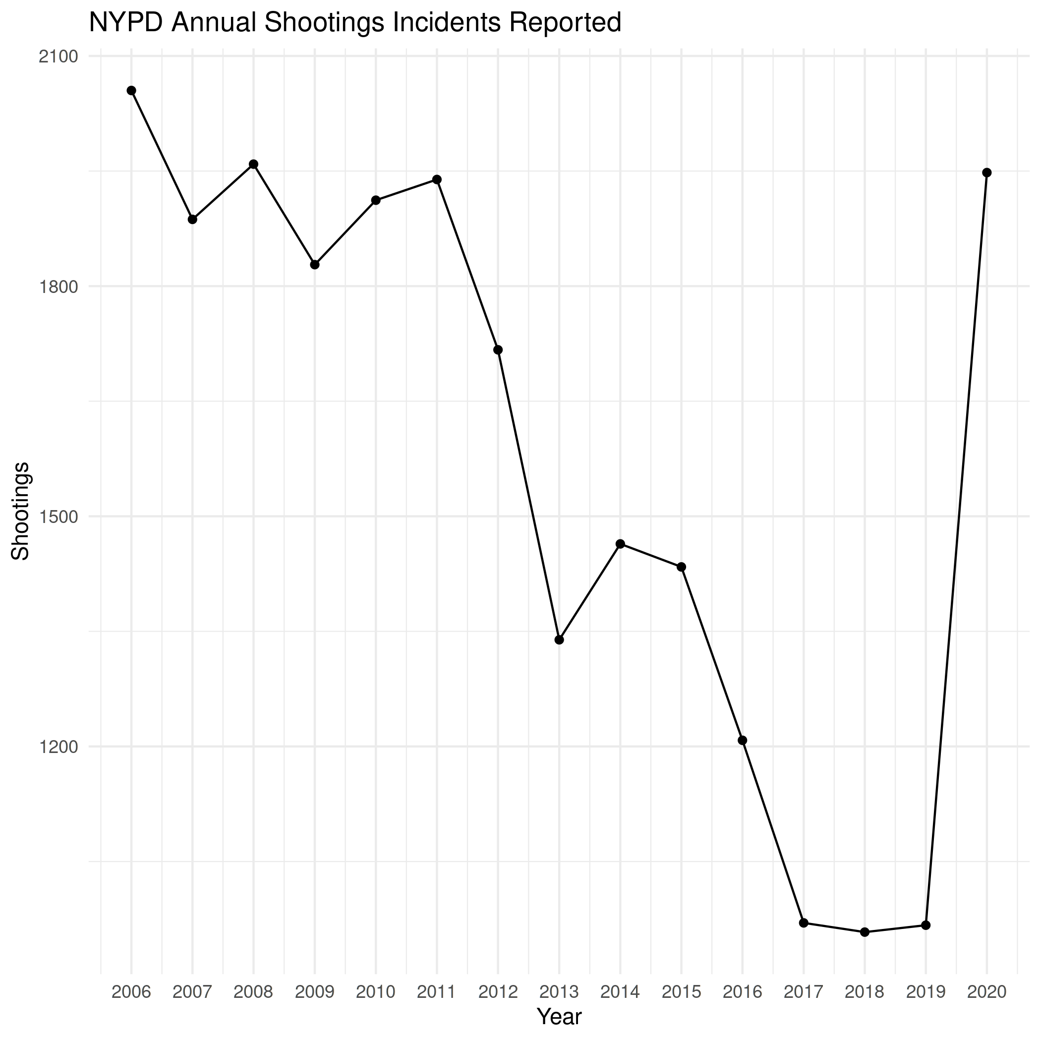
Annually

dates <- data
dates$Year <- floor_date(dates$DATE, "year")

annual_shootings <- dates %>% group_by(Year) %>% summarise(Shootings=n())
kable(annual_shootings,
      format.args=list(big.mark=","))
Year Shootings
2006-01-01 2,055
2007-01-01 1,887
2008-01-01 1,959
2009-01-01 1,828
2010-01-01 1,912
2011-01-01 1,939
2012-01-01 1,717
2013-01-01 1,339
2014-01-01 1,464
2015-01-01 1,434
2016-01-01 1,208
2017-01-01 970
2018-01-01 958
2019-01-01 967
2020-01-01 1,948
theme_set(theme_minimal())
PATH = "../files/posts/nypd-shooting-incident-data/"
join_path = partial(paste, PATH, sep="")
plot = ggplot(data=annual_shootings, aes(x=Year, y=Shootings)) +
  geom_line() + geom_point() +
  scale_x_date(date_labels="%Y", name="Year", date_breaks="1 year") +
  labs(title="NYPD Annual Shootings Incidents Reported")
ggsave(join_path("annual_shootings.png"),
       plot=plot)

nil

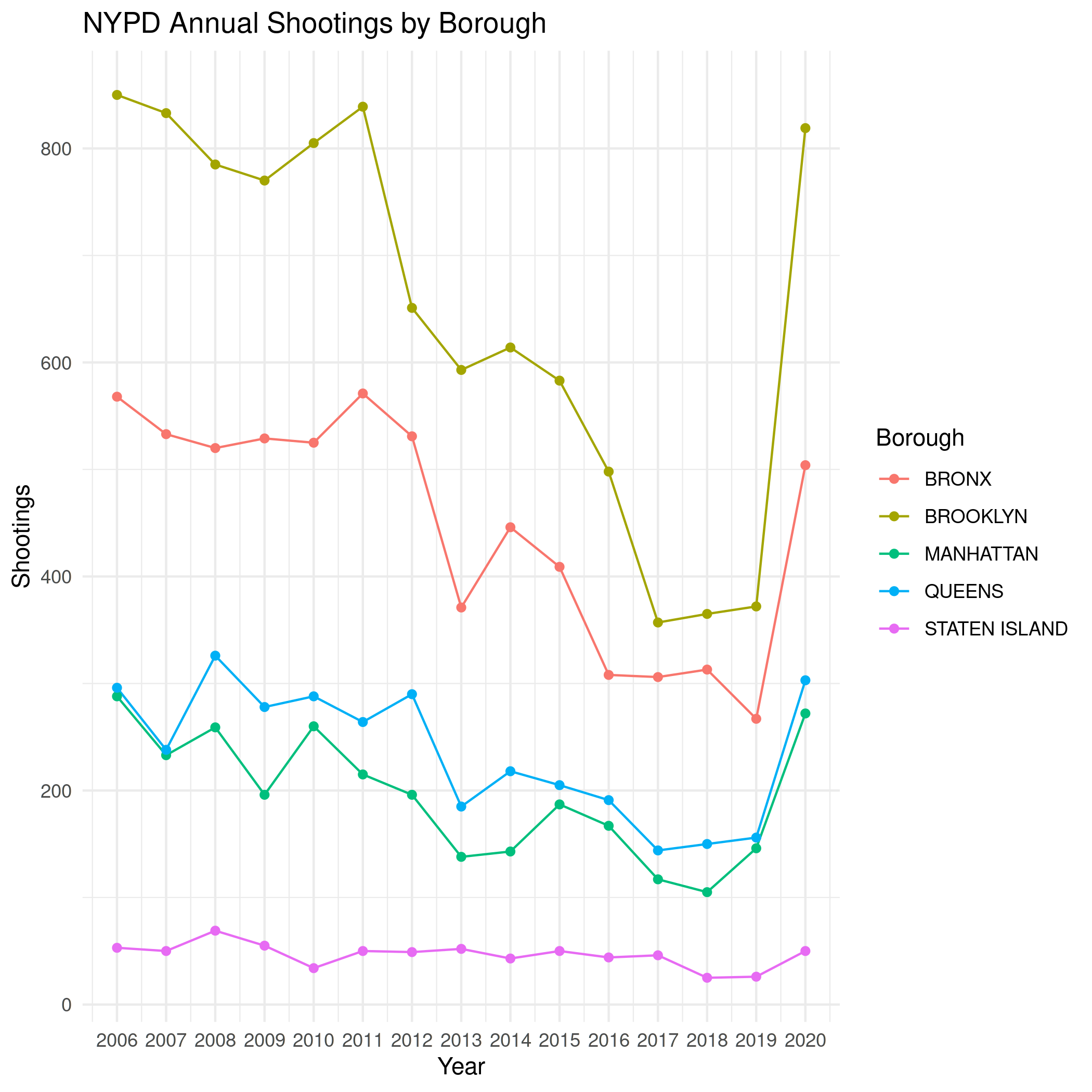
  • By Borough
    borough_shootings <- dates %>% group_by(Year, Borough) %>% summarise(Shootings=n())
    
    file_name = "annual_shootings_boroughs.png"
    plot = ggplot(data=borough_shootings, aes(x=Year, y=Shootings, group=Borough, colour=Borough)) +
      geom_line() + geom_point() +
      scale_x_date(date_labels="%Y", name="Year", date_breaks="1 year") +
      labs(title="NYPD Annual Shootings by Borough")
    ggsave(join_path(file_name),
           plot=plot)
    

    nil

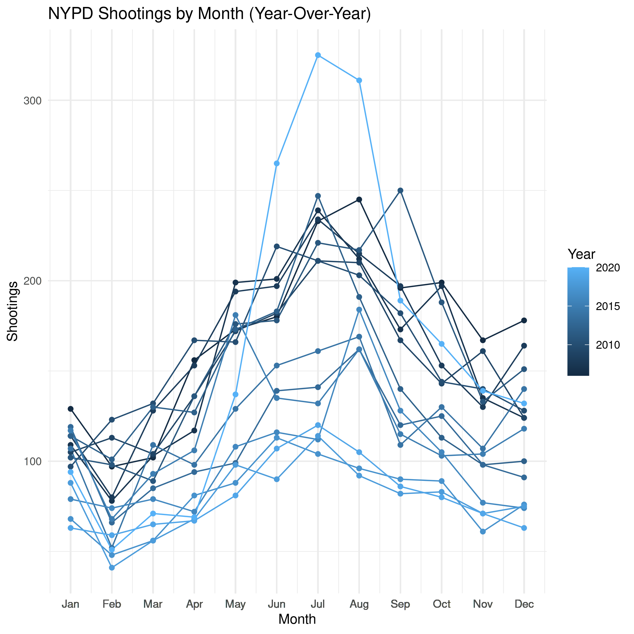
Monthly

dates$year_month <- floor_date(dates$DATE, "month")
monthly_shootings <- dates %>% group_by(year_month) %>% summarise(Shootings=n())

monthly_shootings$month_number <- as.numeric(
  format(as.Date(monthly_shootings$year_month), "%m"))
monthly_shootings$Month <- months(as.Date(monthly_shootings$year_month),
                                  abbreviate=TRUE)
monthly_shootings$Year <- year(ymd(monthly_shootings$year_month))
monthly_shootings
plot = ggplot(data=monthly_shootings,
              aes(x=month_number,
                  y=Shootings,
                  group=Year, colour=Year)) +
  geom_line() + geom_point() +
  scale_x_continuous(breaks=monthly_shootings$month_number,
                     labels=monthly_shootings$Month, name="Month") +
  labs(title="NYPD Shootings by Month (Year-Over-Year)")

ggsave("../files/posts/nypd-shooting-incident-data/monthly_shootings.png",
       plot=plot)

nil

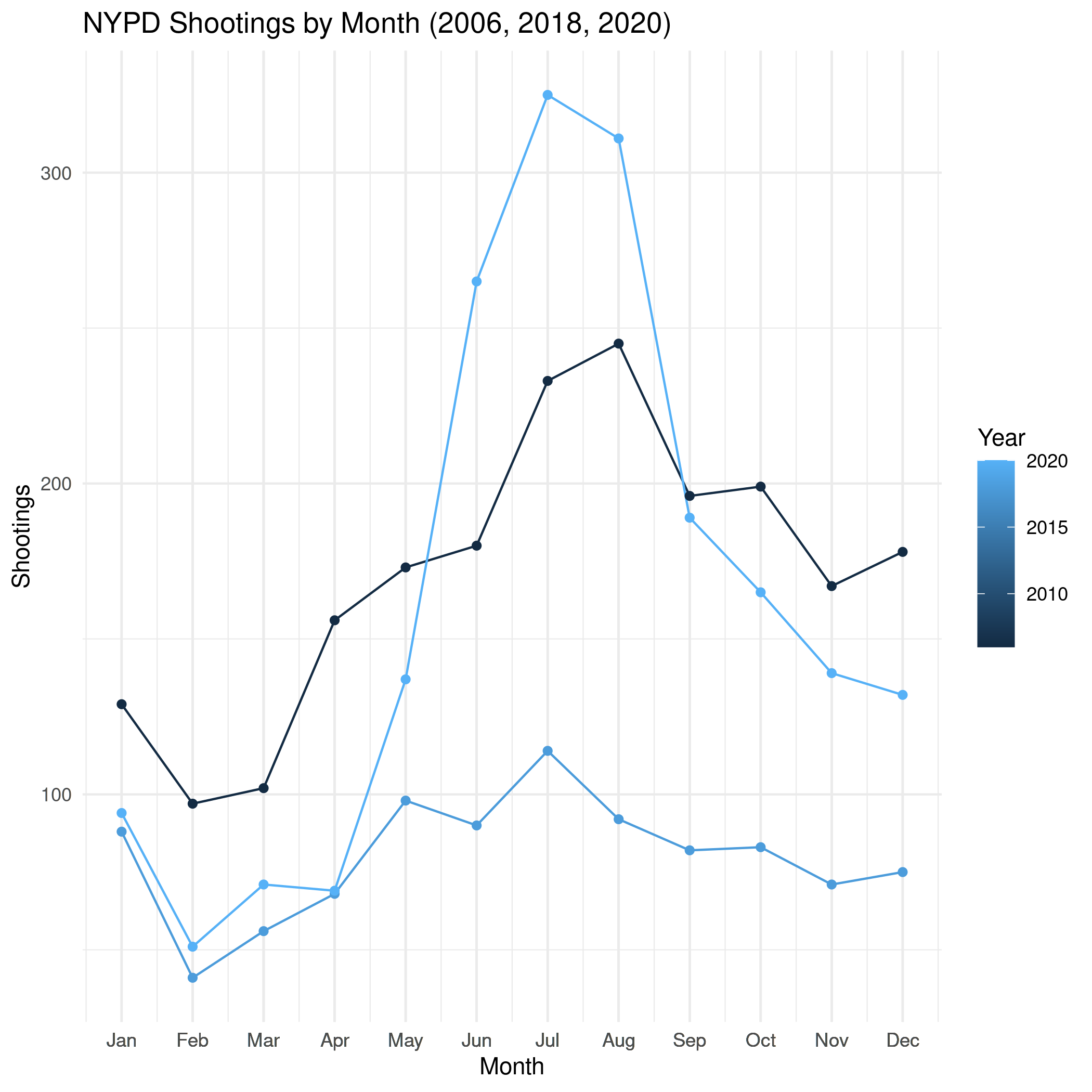
three_years = monthly_shootings[which(monthly_shootings$Year %in% c(2006, 2018, 2020)),]

plot = ggplot(data=three_years,
              aes(x=month_number,
                  y=Shootings,
                  group=Year, colour=Year)) +
  geom_line() + geom_point() +
  scale_x_continuous(breaks=three_years$month_number,
                     labels=three_years$Month, name="Month") +
  labs(title="NYPD Shootings by Month (2006, 2018, 2020)")

ggsave("../files/posts/nypd-shooting-incident-data/monthly_shootings_three-years.png",
       plot=plot)

nil

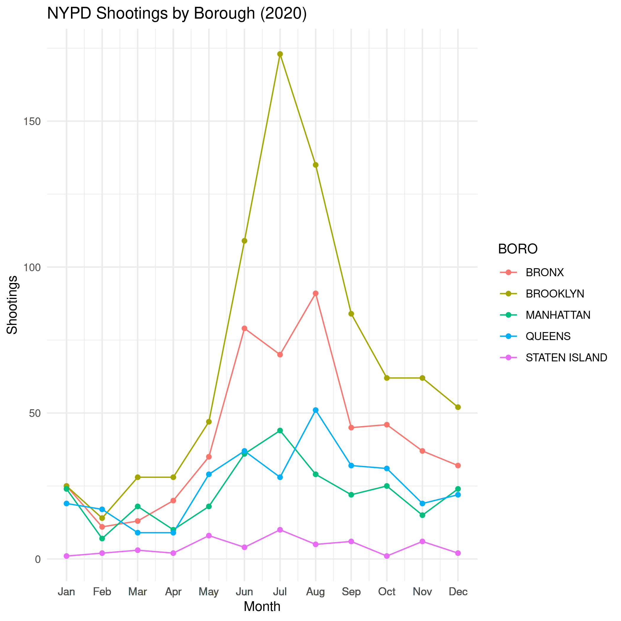
  • By Borough
    borough_monthly <- dates %>% group_by(year_month, BORO) %>% summarise(Shootings=n())
    
    borough_monthly$monthly_number <- as.numeric(
      format(as.Date(borough_monthly$year_month), "%m"))
    borough_monthly$Month <- months(as.Date(borough_monthly$year_month),
                                    abbreviate=TRUE)
    borough_monthly$Year <- year(ymd(borough_monthly$year_month))
    borough_monthly
    
    boroughs_2020 = borough_monthly[which(borough_monthly$Year %in% c(2020)),]
    
    plot = ggplot(data=boroughs_2020,
                  aes(x=monthly_number,
                      y=Shootings,
                      group=BORO, colour=BORO)) +
      geom_line() + geom_point() +
      scale_x_continuous(breaks=boroughs_2020$monthly_number,
                         labels=boroughs_2020$Month, name="Month") +
      labs(title="NYPD Shootings by Borough (2020)")
    
    ggsave(join_path("monthly_shootings_by_borough.png"),
           plot=plot)
    

    nil

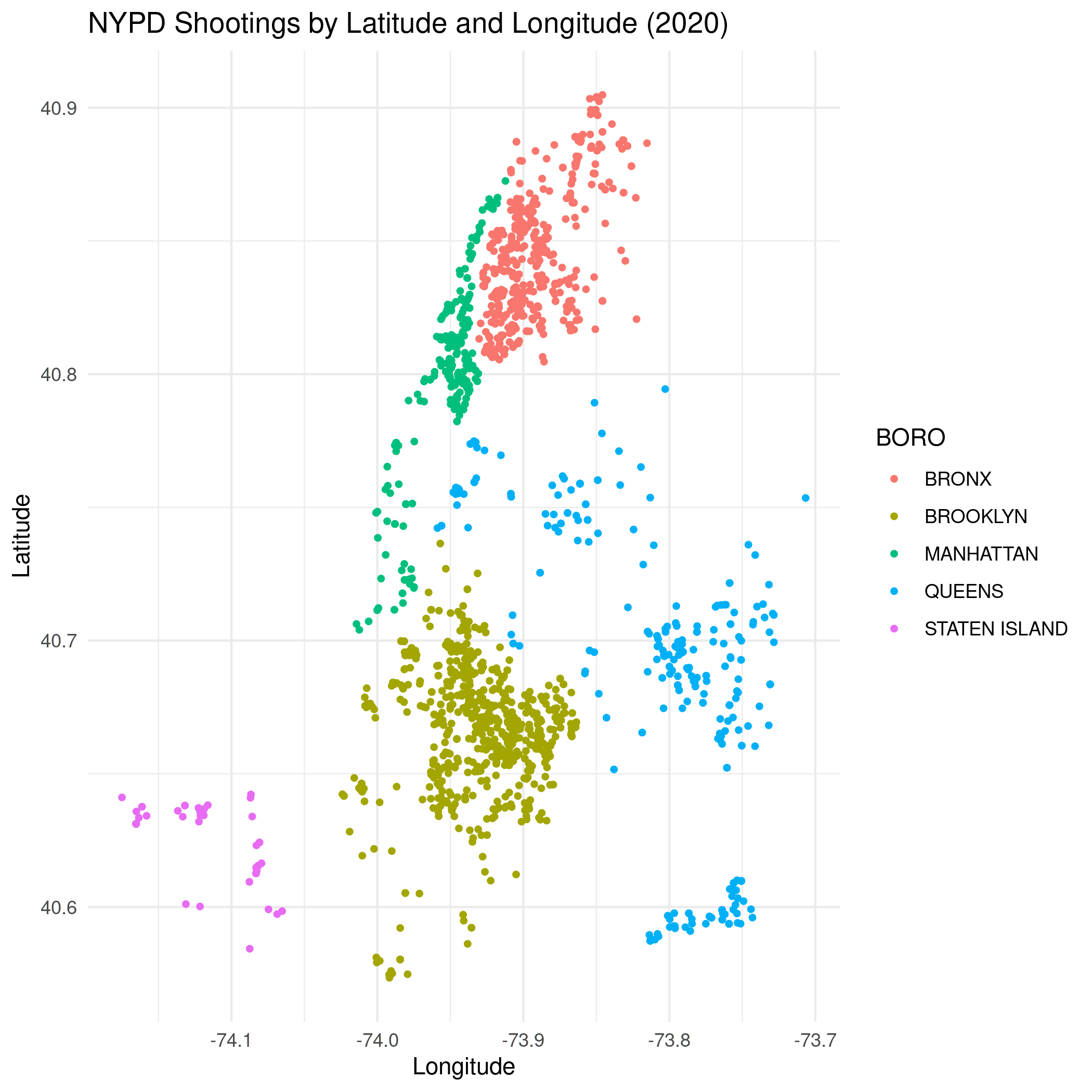
By Map

dates$Year <- year(ymd(dates$year_month))
last_year <- dates[dates$Year==2020,]
last_year
minimum_latitude = min(last_year$Latitude)
maximum_latitude = max(last_year$Latitude)
minimum_longitude = min(last_year$Longitude)
maximum_longitude = max(last_year$Longitude)


plot = ggplot(data=last_year,
              aes(x=Longitude,
                  y=Latitude, color=BORO)) +
  geom_point(size=1) +
  scale_x_continuous(limits=c(minimum_longitude, maximum_longitude)) +
  scale_y_continuous(limits=c(minimum_latitude, maximum_latitude)) +
  labs(title="NYPD Shootings by Latitude and Longitude (2020)")

ggsave(join_path("monthly_shootings_latitude_longitude.png"),
       plot=plot)

nil

R Babel Test

x <- rnorm(100)
summary(x)
    Min.  1st Qu.   Median     Mean  3rd Qu.     Max. 
-1.93398 -0.79415  0.01453 -0.01418  0.67102  2.20682

Does it keep the variables alive between blocks?

summary(x)
    Min.  1st Qu.   Median     Mean  3rd Qu.     Max. 
-1.93398 -0.79415  0.01453 -0.01418  0.67102  2.20682

Looks like it.

Insertion Sort

\(\def\sc#1{\dosc#1\csod} \def\dosc#1#2\csod{{\rm #1{\small #2}}}\)

The Insertion Sort

The insertion sort is an instance of a Decrease And Conquer algorithm and is another case where you maintain a sorted sub-list at the beginning of the list of elements to sort (similar to {selection sort) but instead of scanning the entire unsorted section for the next smallest item to pick (as in "selection sort") you pick the next item in the unsorted and scan down through the sorted section until you find the right place to insert it. This has the slight advantage over selection sort in that you might not have to scan the entire sorted section to find where to insert the next item, while you always have to scan the entire unsorted section to find the next item to select in the selection sort. On the other hand, instead of swapping just two items at the end of each loop, as in the selection sort, with the insertion sort you have to shift every item above where the next item is going to be inserted in order to make a space for it.

The Algorithm Parts

This is taken pretty straight from How To Think About Algorithms.

  • Specification: This is a Sorting Problem.
  • Basic Steps: Repeatedly insert an item where it belongs.
  • Measure of Progress: The number of elements we've inserted so far.
  • The Loop Invariant: The inserted elements are in sorted order.
  • Main Steps: Take an unselected item and insert it into the correct place in the sorted list.
  • Make Progress: We always insert an item.
  • Maintain the Loop Invariant:
    • \( \langle \textit{Loop Invariant} \rangle\): Insertion List is sorted.
    • \(\lnot \langle \textit{Exit-Condition} \rangle \): There's more to sort.
    • \(\sc{CodeLoop}\): The item that was chosen was inserted in the place that maintains the loop invariant.
  • Establish the Loop Invariant: Pick the first item from the unsorted list giving us a sorted list with one item.
  • Exit Condition: We've inserted all the items.
  • Ending:
    • \(\langle \textit{Exit-Condition} \rangle\): All elements were inserted.
    • \(\langle \textit{Loop Invariant} \rangle\): All inserted elements are in the right order.
    • \(\rightarrow \langle \textit{Post-Condition} \rangle\): All the elements are in sorted order.

The Pseudocode

\begin{algorithm}
\caption{InsertionSort}
\begin{algorithmic}
\INPUT An array of orderable items
\OUTPUT The array sorted in ascending order
\PROCEDURE{InsertionSort}{$A$}
  \FOR{$i \gets 1$ to $n - 1$}
    \STATE $v \gets A[i]$
    \STATE $j \gets i - 1$
    \WHILE{$j \geq 0$ and $A[j] > v$}
       \STATE $A[j + 1] \gets A[j]$
       \STATE $j \gets j - 1$
    \ENDWHILE
    \STATE $A[j + 1] \gets v$
  \ENDFOR
\ENDPROCEDURE
\end{algorithmic}
\end{algorithm}

The outer loop tracks the boundary between the sorted section of the list (elements whose index is less than i) and the unsorted section (i to the end of the list). Every time through the outer loop we pick the next item to insert (and assign it to v) then in the while loop we traverse the list backwards, moving the items up one in the list until we find a place where the value to insert isn't less than the next item in the array (or we haven't reached the start of the list). Once we end up at the place to insert the value we exit the while loop and insert the value where we stopped. Then we move our outer loop up one and start again until everything's sorted.

Runtime

Given the two loops you can probably guess that it's going to be \(\Theta(n^2)\), but I'll go through it so I don't forget later on.

\begin{align} C_{worst} &= \sum_{i=1}^{n - 1} \sum_{j=0}^{i-1} 1\\ &= \sum_{i=1}^{n - 1} ((i - 1) - 0 + 1) \\ &= \sum_{i=1}^{n - 1} i \end{align}

This is pretty similar to what I had in the Bubble Sort: Runtime Explained post so I won't go over the reasons for the steps, but at this point we can use the summing backwards and forwards of the series trick to see what our worst-case runtime is.

\begin{array}{ccccccccc} & 1 & + & 2 & + & \cdots & + & (n - 2) & + & (n - 1) \\ + & (n - 1) & + & (n - 2) & + & \cdots & + & 2 & + & 1 \\ \hline & n & + & n & + & \cdots & + & n & + & n\\ \end{array}

So we have n - 1 terms of n in our doubled runtime which we can then halve to get:

\[ C_{worst} = \frac{n (n - 1)}{2} \in \Theta(n^2) \]

Implement It

I'll try and copy the way the selection and bubble sorts looked to make it easier to compare them later.

Imports

# python
from collections import namedtuple
from collections.abc import MutableSequence

Some Types

Note: For my future self: using the dataclass is the python way to make a data object, but numba doesn't like it, so we can't use it.

@dataclass
class InsertionOutput:
    element_count: int
    comparisons: int
    swaps: int
    elements: MutableSequence

I'll use the regular namedtuple instead.

InsertionOutput = namedtuple("InsertionOutput", ["element_count",
                                                 "comparisons",
                                                 "swaps",
                                                 "elements"])

The Counter

def insertion_sort(elements: MutableSequence) -> InsertionOutput:
    """Sorts elements using iterative insertion-sort

    Args:
     elements: sortable collection of elements

    Returns:
     count of elements, comparisons made, swaps made, sorted elements
    """
    comparisons = swaps = 0
    for next_unsorted_cell in range(1, len(elements)):
        thing_to_insert = elements[next_unsorted_cell]

        in_front_of_me, to_the_right = (next_unsorted_cell - 1,
                                        next_unsorted_cell)

        while not (in_front_of_me < 0 or
                   elements[in_front_of_me] <= thing_to_insert):
            comparisons += 1
            swaps += 1
            elements[to_the_right] = elements[in_front_of_me]
            in_front_of_me, to_the_right = (in_front_of_me - 1,
                                            in_front_of_me)

        elements[to_the_right] = thing_to_insert
        swaps += 1

    return InsertionOutput(len(elements), comparisons, swaps, elements)

I negated the while-condition and re-stated the body to make more sense to me. Hopefully it's still clear what's going on.

Some Simple Testing

Importing

# python
from functools import partial
import random

# pypi
from expects import contain_exactly, equal, expect
from joblib import Parallel, delayed
from numba import njit
from numpy.random import default_rng

import altair
import numpy
import pandas

# this project
from bowling.sort.insertion import insertion_sort

# my stuff
from graeae import Timer
from graeae.visualization.altair_helpers import output_path, save_chart

Set Up

numba_random = default_rng(2022)
TIMER = Timer()

SLUG = "insertion-sort"
OUTPUT_PATH = output_path(SLUG)
save_it = partial(save_chart, output_path=OUTPUT_PATH)

Worst Case

n = 100
inputs = list(reversed(range(n)))
expected = list(sorted(inputs.copy()))

output = insertion_sort(inputs)

expect(output.elements).to(contain_exactly(*expected))

expect(output.comparisons).to(equal((n * (n - 1))/2))

Best Case

inputs = expected.copy()
output = insertion_sort(inputs)
expect(output.elements).to(contain_exactly(*expected))

expect(output.comparisons).to(equal(0))
expect(output.swaps).to(equal(n - 1))

Maybe comparisons is the wrong term since it's really counting the number of times we get past the sentinel in the while statement, but I don't think there's a good way to count how many times the sentinel gets checked, so the swaps has to act as a proxy for this best-case scenario where we never drop into the while loop.

Random

inputs = random.choices(inputs, k=n)
expected = list(sorted(inputs.copy()))

output = insertion_sort(inputs)

expect(output.elements).to(contain_exactly(*expected))

print((n * (n - 1))/2)
print(output.comparisons)
print(output.swaps)
4950.0
2585
2684

Comparisons and Swaps

numba_sort = njit(insertion_sort)
things_to_sort = [numba_random.integers(low=0, high=count, size=count)
                  for count in range(1, 10**5 + 1, 1000)]
with TIMER:
    sort_output = Parallel(n_jobs=-1)(
        delayed(numba_sort)(thing_to_sort)
        for thing_to_sort in things_to_sort)
Started: 2022-01-16 22:55:12.336777
Ended: 2022-01-16 22:55:23.534382
Elapsed: 0:00:11.197605
SIZE, COMPARISONS, SWAPS = 0, 1, 2
unzipped = list(zip(*sort_output))
count_frame = pandas.DataFrame({"Elements": unzipped[SIZE],
                                "Insertion": unzipped[SWAPS]})

count_frame["n^2"] = count_frame.Elements**2

melted = count_frame.melt(id_vars=["Elements"], var_name="Source", value_name="Runtime")
tooltip = [altair.Tooltip("Elements", format=","),
           altair.Tooltip("Runtime", format=","), 
           altair.Tooltip("Source:N")]

chart = altair.Chart(melted).mark_point().encode(
    x = "Elements",
    y = "Runtime",
    color="Source:N",
    tooltip=tooltip
).properties(
    width=800, height=525, title="Insertion Sort"
)

save_it(chart, "insertion-sort-comparisons")

Figure Missing

With our random input the Insertion Sort does better than the theoretical worst case.

Best and Worst Cases

Let's get rid of the \(n^2\) and add the best-case and worst-case data.

frame = count_frame.rename(columns={"Insertion": "Random"})
del frame["n^2"]
best_things = [numpy.arange(count, dtype=int) for count in range(1, 10**5+ 1, 1000)]
worst_things = [numpy.flip(things) for things in best_things]

with TIMER:
    worst_output = Parallel(n_jobs=-1)(
        delayed(numba_sort)(thing) for thing in worst_things
)
Started: 2022-01-16 22:56:34.282090
Ended: 2022-01-16 22:56:56.373266
Elapsed: 0:00:22.091176
with TIMER:
    best_output = Parallel(n_jobs=-1)(
        delayed(numba_sort)(thing) for thing in best_things
)
Started: 2022-01-16 22:57:04.941850
Ended: 2022-01-16 22:57:05.067092
Elapsed: 0:00:00.125242
best_unzipped = list(zip(*best_output))
worst_unzipped = list(zip(*worst_output))

frame["Best"] = best_unzipped[SWAPS]
frame["Worst"] = worst_unzipped[SWAPS]
melted = frame.melt(id_vars=["Elements"],
                    var_name="Input",
                    value_name="Comparisons")
chart = altair.Chart(melted).mark_point().encode(
    x="Elements",
    y="Comparisons",
    color="Input",
    tooltip=[altair.Tooltip("Elements", format=","),
             altair.Tooltip("Comparisons", format=","),
             "Input"],
).properties(
    title="Insertion Sort Best, Worst, Random",
    width=800,
    height=525
).interactive()

save_it(chart, "best-worst-random")

Figure Missing

Here we can see why Insertion Sort is considered better than Bubble and Selection Sort. In those cases they have to traverse the entire unsorted collection every time but Insertion Sort only picks whatever is the next unsorted item and searches the sorted until it finds the right place to insert it. In the worst case they're all the same, but whenever it isn't the worst case insertion sort offers a little improvement.

The Swaps

Let's look at what plotting the location of the elements as they are swapped looks like.

def insertion_swaps(elements) -> dict:
    """Keeps track of the element indexes as they are swapped

    Args:
     elements: list of orderable elements

    Returns:
     dict mapping element to list of indices where it was in the elements list
    """
    swaps = {element: [index] for index, element in enumerate(elements)}

    number_of_elements = len(elements)

    for next_unsorted_cell in range(1, len(elements)):
        thing_to_insert = elements[next_unsorted_cell]

        in_front_of_me, to_the_right = (next_unsorted_cell - 1,
                                        next_unsorted_cell)

        while not (in_front_of_me < 0 or
               elements[in_front_of_me] <= thing_to_insert):
            elements[to_the_right] = elements[in_front_of_me]
            in_front_of_me, to_the_right = (in_front_of_me - 1,
                                            in_front_of_me)

        elements[to_the_right] = thing_to_insert

        for index, element in enumerate(elements):
            swaps[element].append(index)

    return swaps

A little sanity check.

inputs = random.choices(inputs, k=n)
expected = list(sorted(inputs.copy()))

output = insertion_swaps(inputs)

expect(inputs).to(contain_exactly(*expected))

Random Case

COUNT = 50

inputs = list(range(COUNT))
random.shuffle(inputs)
swaps = insertion_swaps(inputs)

track_frame = pandas.DataFrame(swaps)
re_indexed = track_frame.reset_index().rename(columns={"index": "Swap"})
melted = re_indexed.melt(var_name="Value To Sort",
                         value_name="Location In Array", id_vars="Swap")
chart = altair.Chart(melted).mark_line().encode(
    x="Swap",
    y="Location In Array",
    color="Value To Sort:O",
    tooltip=["Swap", "Location In Array", "Value To Sort"]
).properties(
    title="Insertion Sort Insertions",
    width=800,
    height=525,
).interactive()

save_it(chart, "insertion-sort-swaps")

Figure Missing

To interpret the chart, the y-axis values are the indices of the input list and as we move left to right along the x-axis we are traversing the outer loop. Everytime a line goes from horizontal to a downward slope that means that the element at the y location was plucked from the unsorted section and inserted into the previously sorted section. The longer the downward line, the further back it had to go in the sorted section before being inserted (and so the more items had to be moved aside for it to find its place).

Worst Case Swaps

Now we'll take a look at what the swaps look like when the collection to be sorted is in exactly the reversed order.

COUNT = 50

inputs = list(reversed(range(COUNT)))
swaps = insertion_swaps(inputs)

track_frame = pandas.DataFrame(swaps)
re_indexed = track_frame.reset_index().rename(columns={"index": "Swap"})
melted = re_indexed.melt(var_name="Value To Sort",
                         value_name="Location In Array", id_vars="Swap")
chart = altair.Chart(melted).mark_line().encode(
    x="Swap",
    y="Location In Array",
    color="Value To Sort:O",
    tooltip=["Swap", "Location In Array", "Value To Sort"]
).properties(
    title="Insertion Sort Insertions (Worst-Case)",
    width=800,
    height=525,
).interactive()

save_it(chart, "worst-case-insertion-sort-swaps")

Figure Missing

So, here we don't have the mostly short lines of the previous chart because every element had to be inserted at the beginning of the previously sorted section of the list.

Compare The Three Amigos

We've had three brute-force sorters so far, let's see if there's a noticeable difference in their comparisons.

from bowling.sort.bubble.bubble import bubba
from bowling.sort.selection import selection_counter
numba_bubble = njit(bubba)
with TIMER:
    bubble_output = Parallel(n_jobs=-1)(
        delayed(numba_bubble)(thing_to_sort)
        for thing_to_sort in things_to_sort)
Started: 2022-01-11 23:38:40.676138
Ended: 2022-01-11 23:40:07.211075
Elapsed: 0:01:26.534937
numba_selection = njit(selection_counter)
with TIMER:
    selection_output = Parallel(n_jobs=-1)(
        delayed(numba_selection)(thing_to_sort)
        for thing_to_sort in things_to_sort)
Started: 2022-01-11 23:00:03.404894
Ended: 2022-01-11 23:00:43.390039
Elapsed: 0:00:39.985145
unzipped = list(zip(*bubble_output))

count_frame["Bubble"] = unzipped[COMPARISONS]

unzipped = list(zip(*selection_output))

count_frame["Selection"] = unzipped[COMPARISONS]
count_frame = count_frame.rename(columns={"Insertion Comparisons": "Insertion"})
frame = count_frame.melt(id_vars=["Elements"], var_name="Sorter", value_name="Comparisons")
tooltip = [altair.Tooltip("Elements", format=","),
           altair.Tooltip("Comparisons", format=","), 
           altair.Tooltip("Sorter")]

chart = altair.Chart(frame).mark_point().encode(
    x="Elements",
    y="Comparisons",
    color="Sorter",
    tooltip=tooltip,
).properties(
    width=800, height=550, title="The Three Amigos"
).interactive()

save_it(chart, "three-amigos-comparisons")

Figure Missing

You might be looking at the chart and wondering - "Where's the Bubble Sort?". Well, since Selection Sort always checks all the unsorted for the next item, it has to do just as many comparisons as Bubble Sort does so they are (almost) overlapping - since I used the short-circuiting Bubble Sort if you zoom way, way in you'll see that the Bubble Sort's points are actually usually slighly lower than the Selection Sort's line.

I guess the main takeaway is that because the Insertion Sort has an out that lets it short-circuit each inner while-loop it generally will perform better than the other two sorts, although it's still a quadratic sort.

Sources

Iterative Algorithms

Iterative algorithms are characterized by loops - the word iteration has at at its roots the notion of repetition.

The Metaphor

HTTAA describes the iterative algorithms as being like a long journey where you can't see the entire route and could possibly take a misstep and fall into a ditch, so you need a way to know that you're making progress as well as a way to know you haven't veered off the road. Since we're dealing with repetitions I kind of think a racetrack might make more sense, or at least something that loops, but anyway…

There are some basic questions we have to be able to answer to make a successful trip:

  • How do I get onto the road?
  • How do I take a step without falling off the road?
  • How do I know when I've gone far enough?
  • Once I've gone far enough, how do I get off the road and to my ultimate destination?

Too answer these questions we'll be using some basic parts:

  • Our starting point is our Preconditions and to get onto the road we need some pre-loop code to set up the Loop-Invariant.
  • We take a step with our loop-code and keep from falling off the road by maintaining the Loop-Invariant.
  • We know we've gone far enough when our Exit-Condition is met.
  • Once we've gone far enough we use some post-loop code to clean up and end up at our Postconditions.

Translating that to mathishness shorthand:

  • \( \langle \textit{Pre-Conditions} \rangle \land \text{Code}_\textit{Pre-Loop} \Rightarrow \langle \textit{Loop-Invariant} \rangle \)
  • \( \langle \textit{Loop-Invariant} \rangle \land \lnot \langle \textit{Exit-Condition} \rangle \land \text{Code}_\textit{Loop} \Rightarrow \langle \textit{Loop-Invariant'} \rangle \)
  • \( \langle \textit{Loop-Invariant} \rangle \land \langle \textit{Exit-Condition} \rangle \land \text{Code}_\textit{Post-Loop} \Rightarrow \langle \textit{Post-Conditions} \rangle \)

The Sorting Problem

English(ish)

The sorting problem involves taking a list of things that can be compared to each other to decide their order and then sorting them into ascending order (actually non-decreasing, since you can have multiple items with the same value, but, this was supposed to be the plain-English version).

Specification

  • Preconditions: The input is a list of n orderable items, possibly with repetitions.
  • Postconditions: The output is a list of the same n items in non-decreasing order.